Client
Iqra Education
Year
2024
Timeline
3 weeks
Services
Focus
Logo for a Children's Learning Platform
Iqra Education
Logo & Brand Identity for a Children's Learning Platform

Iqra is a web-based education platform for children — tutoring, mentorship, and structured learning programmes built around character development and individual progress. The brand needed to speak to two audiences simultaneously: children, who need to feel engaged and welcomed, and parents, who need to feel confident and trust what they’re handing their child over to.
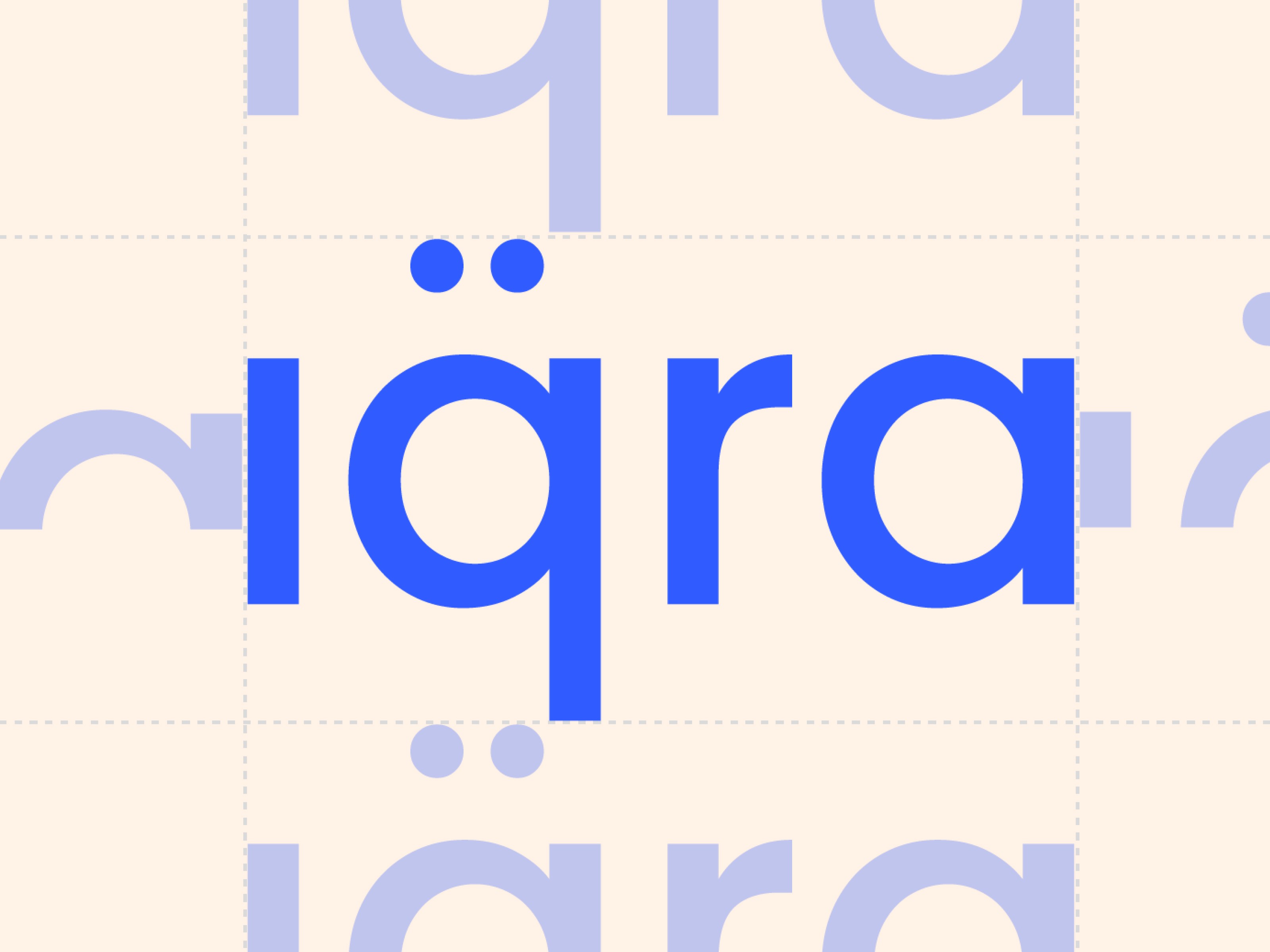
The wordmark is set in a rounded, geometric sans-serif — approachable and legible without being childish. The double dots above the “q” add a distinctive detail that makes the name immediately recognizable at any size, from an app icon to a tote bag. Paired with a custom icon — a hand with radiating lines suggesting light, knowledge, and an open book — the mark communicates learning as something active and expansive, not passive.
The palette is electric blue, warm cream, and red. Blue carries trust and focus. Cream softens the overall register and makes the identity feel approachable rather than institutional. Red appears as an accent — energetic and attention-catching without dominating. Together the three colors give Iqra a visual energy that stands apart from the muted, safe palettes most EdTech brands default to.
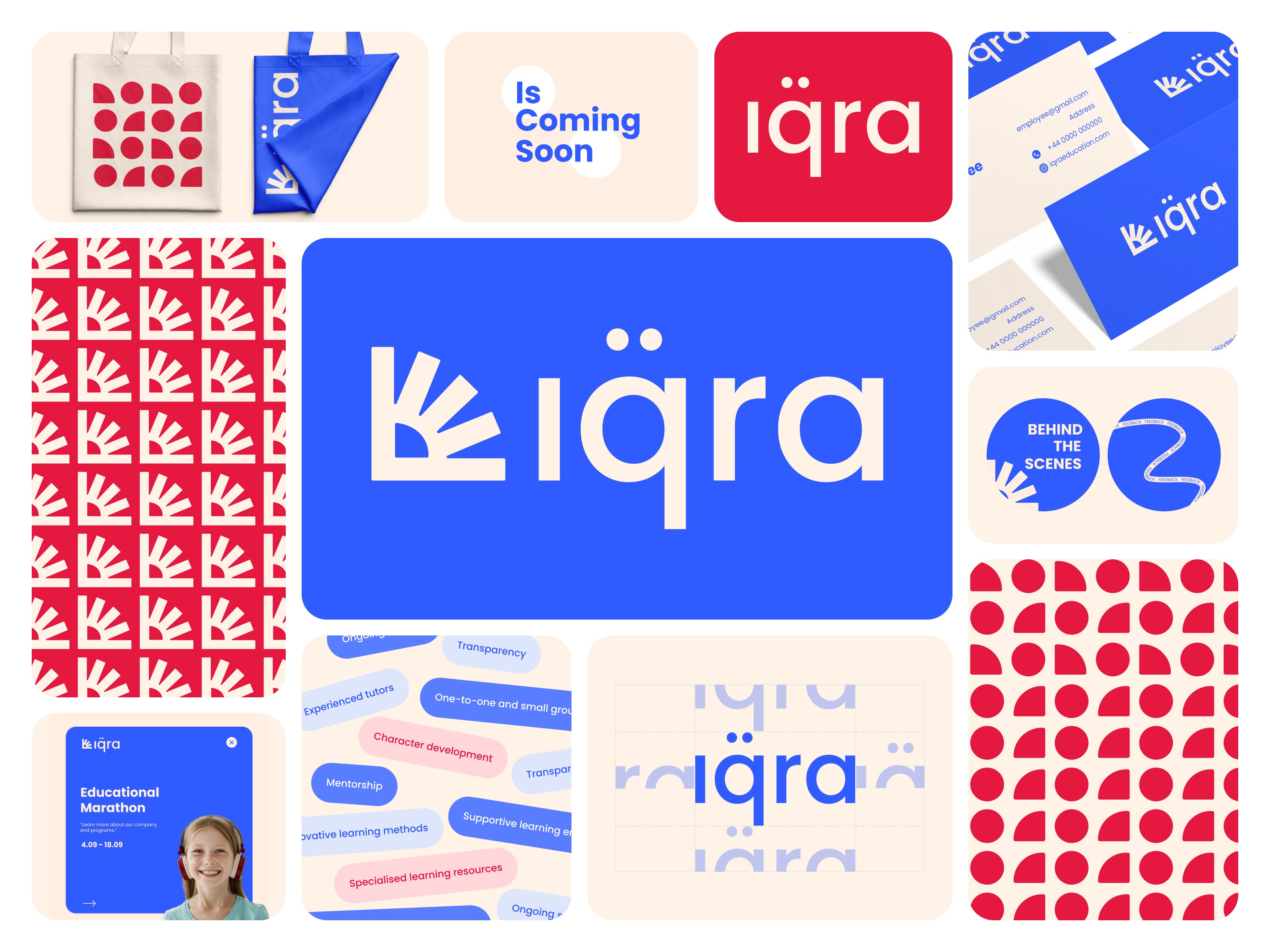
The identity system was built for real-world range: business cards, tote bags, app icon, social media templates, push notifications, patterned print surfaces — all tested and delivered as part of the brand book. The geometric icon works as a standalone pattern element, which gives the brand a visual texture across physical and digital materials without needing to repeat the full logo.
Iqra now has an identity that holds up at every scale and across every surface — confident enough for a parent, energetic enough for a child.

More work
Start Project
Have a product, brand, or website to improve? Tell us what you’re building — we’ll reply within 24 hours.