Client
Cartoli
Year
2026
Timeline
3 weeks
Focus
Industrial Equipment Rental UX/UI Redesign
Cartoli
UX/UI Design for an Industrial Equipment Rental Platform

Cartoli Instruments is a Texas-based distributor of industrial test and measurement equipment — electrical testing, force/torque, thermal imaging, automation, and more. The company sells and rents equipment, but the rental experience was buried inside a third-party Booqable shop with no visual connection to the main brand and no UX designed around how rental decisions actually get made.
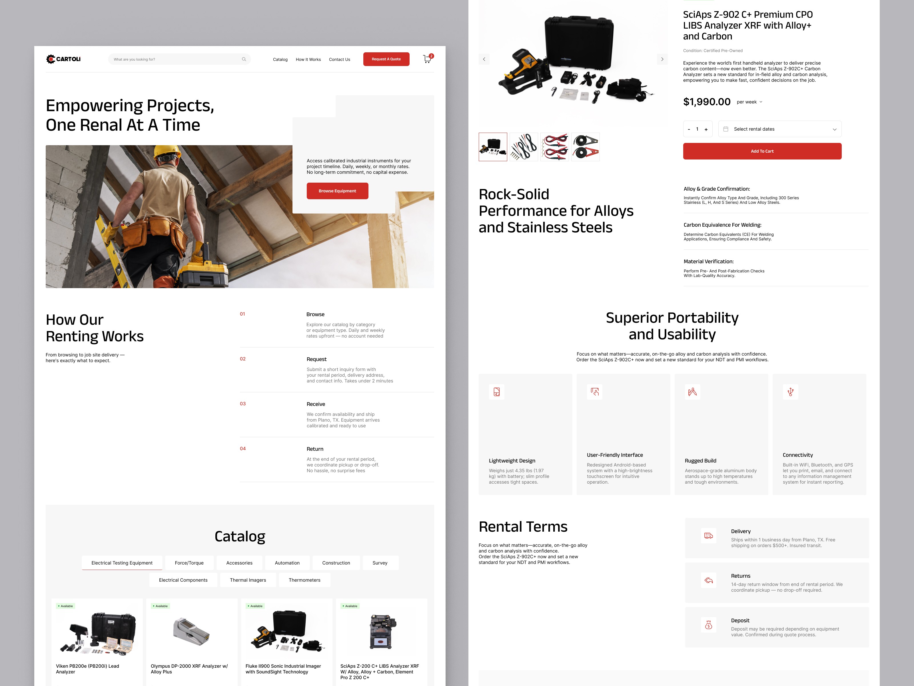
We started with a UX audit: mapping where the existing rental flow broke down, where users lost context, and what information a buyer needs at each stage of a rental decision. The core problem was structural — availability, pricing, and rental period selection were all handled inconsistently, and the path from browsing to requesting a quote had too much friction for a B2B audience making time-sensitive equipment decisions.

The redesign built a dedicated rental experience from the ground up. The information hierarchy was reorganized around the rental model: availability status and price-per-period are prominent on every product card and product page, before anything else. A date-range picker replaces manual text input for rental period selection — intuitive for a user who arrives knowing the dates of their project, not a form field they have to interpret.
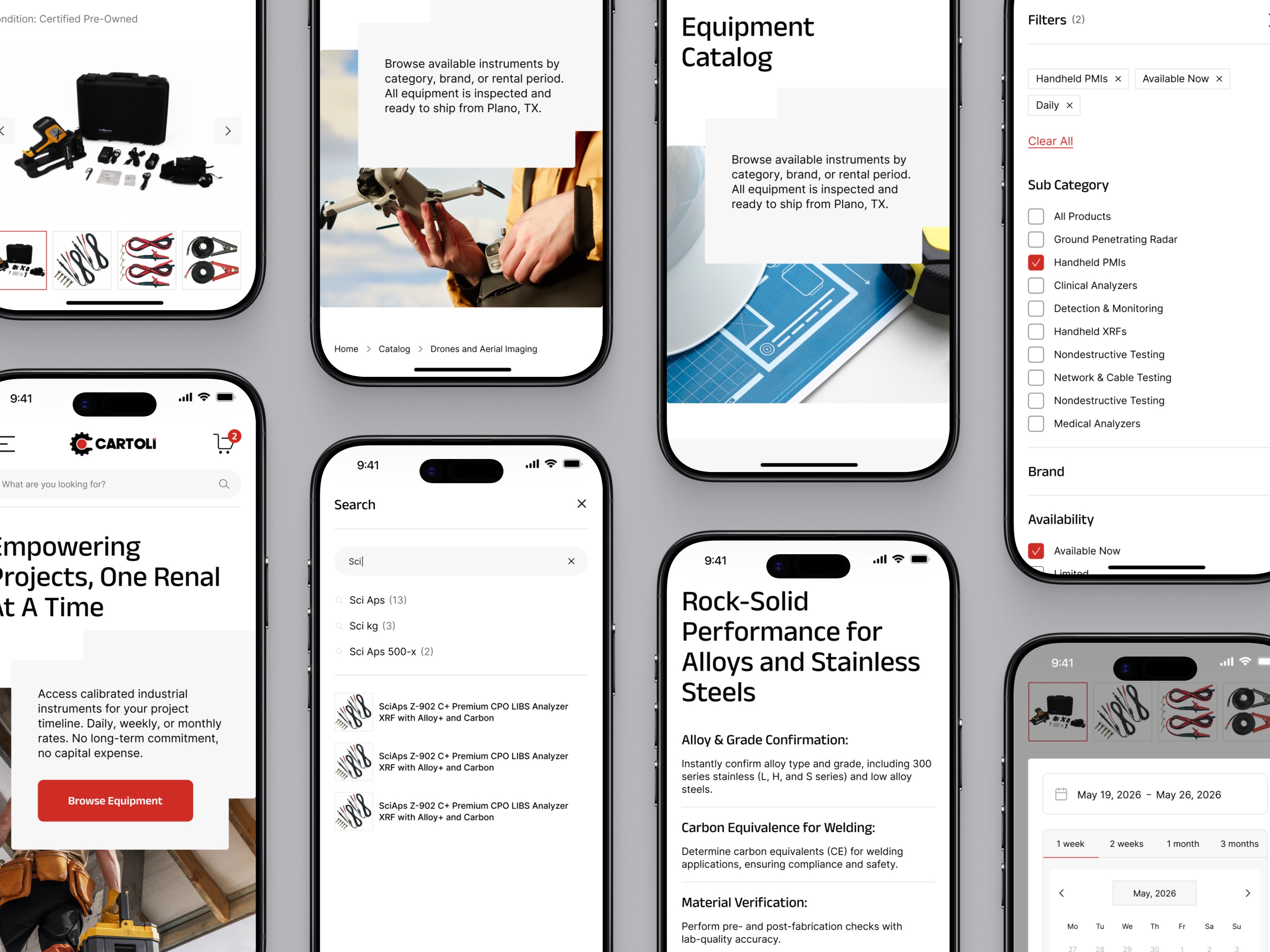
The product detail page was designed around a sticky CTA that stays accessible at all scroll positions on mobile. Request to Rent is reachable without login — no authentication wall between a user and the primary conversion action. Availability badges on every card give a clear visual status: available, limited, or on request.

The search experience handles both found and not-found states cleanly — results surface with product images and categories, and empty states redirect toward the catalog without a dead end.
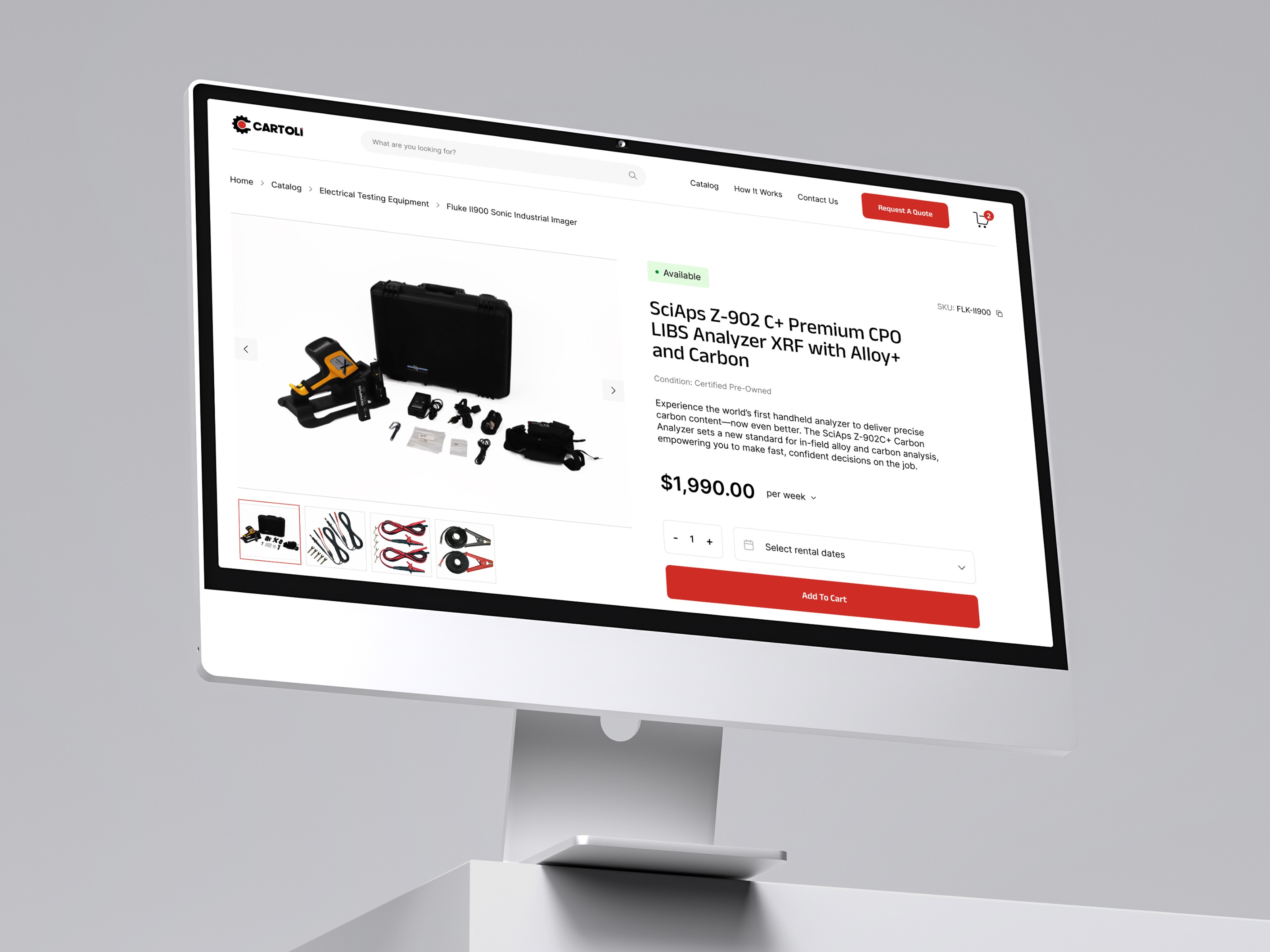
Mobile-first approach was applied throughout the product detail and request form screens. Desktop and mobile designs were delivered as a full Figma file with UI components — buttons, cards, form fields, availability badges — structured as a design system with developer handoff notes and a Loom walkthrough of the complete flow.

More work
Start Project
Have a product, brand, or website to improve? Tell us what you’re building — we’ll reply within 24 hours.