Client
LifeStack
Year
2024
Timeline
6 weeks
Services
Mobile App Design
LifeStack
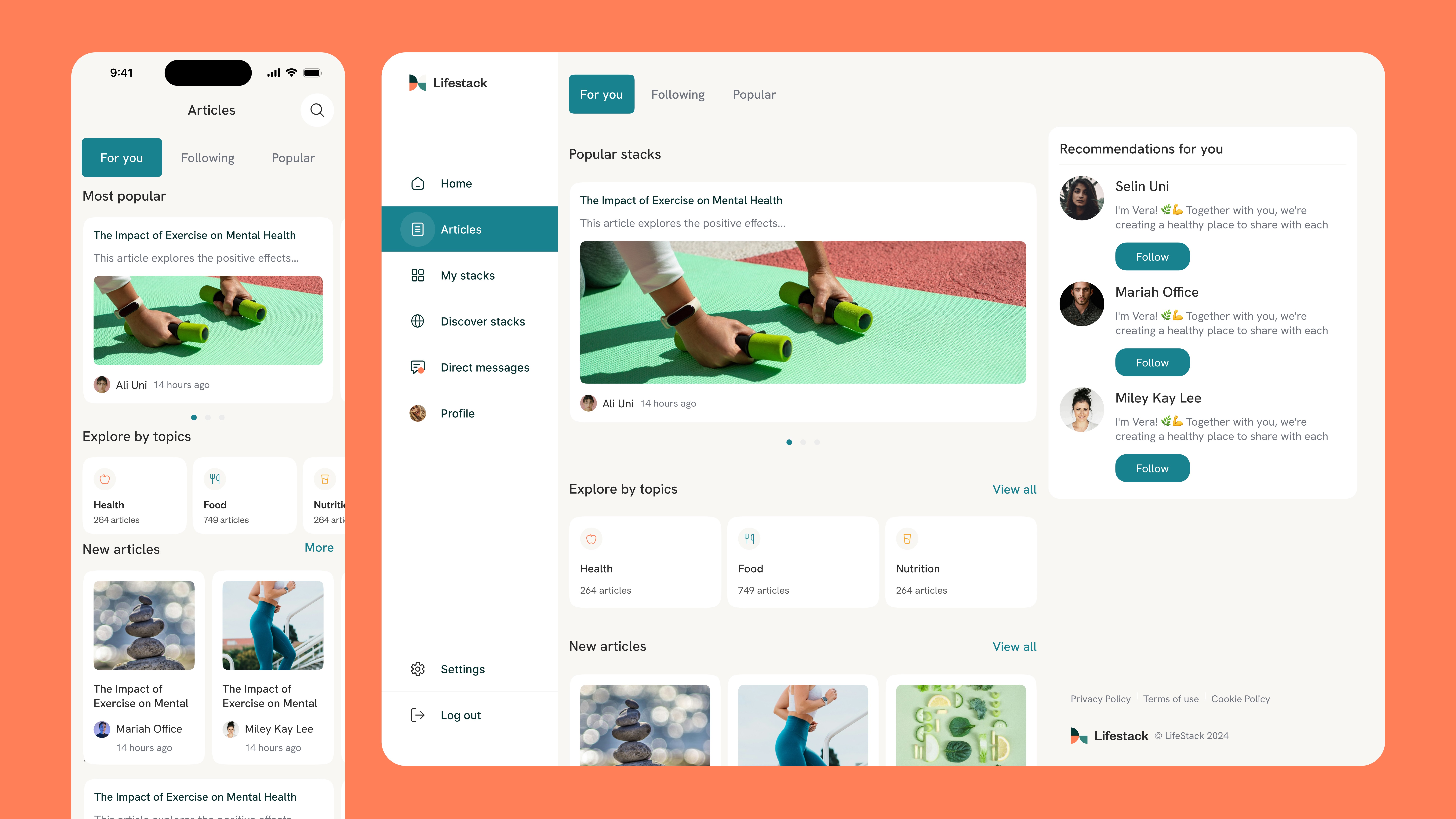
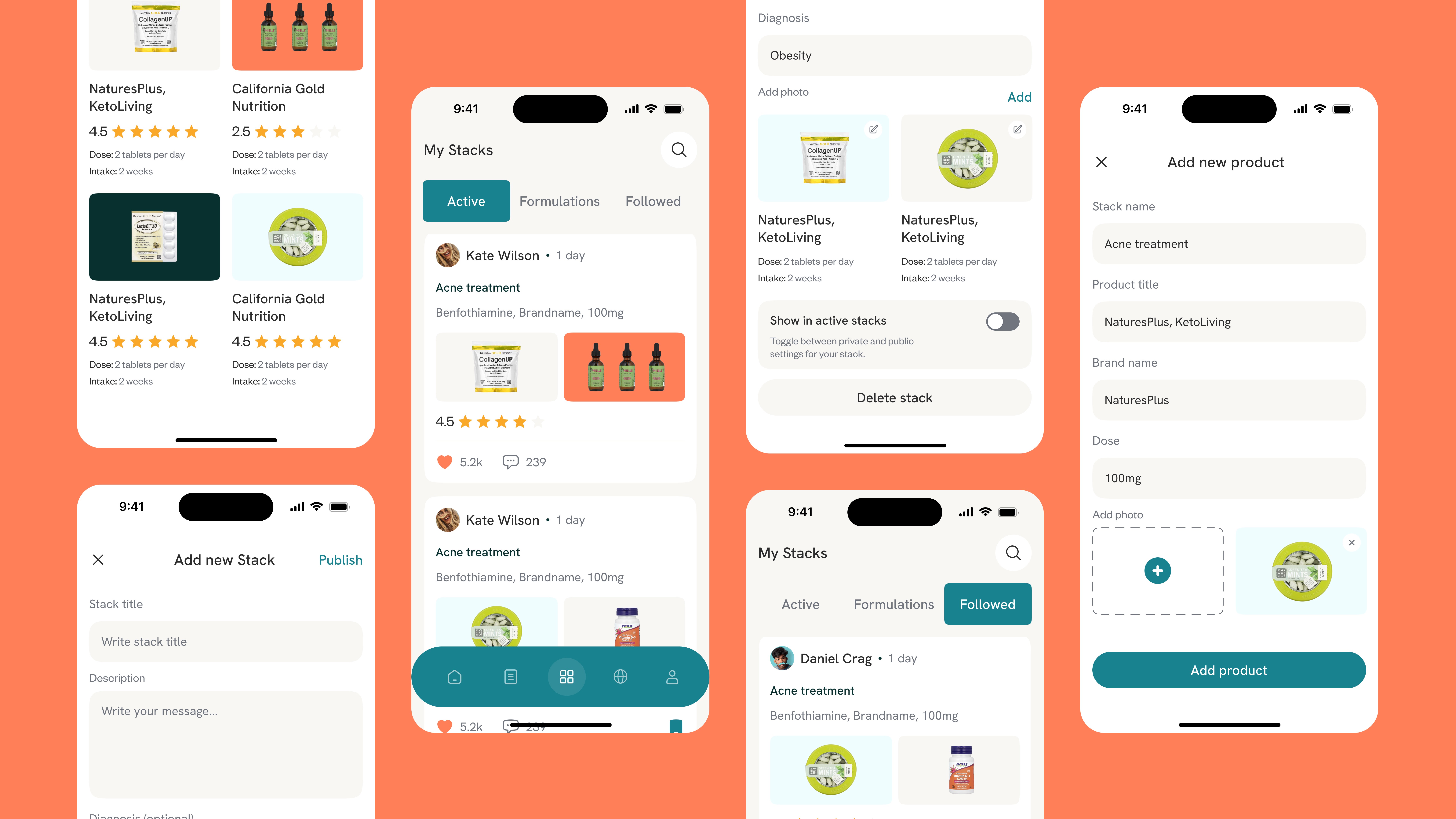
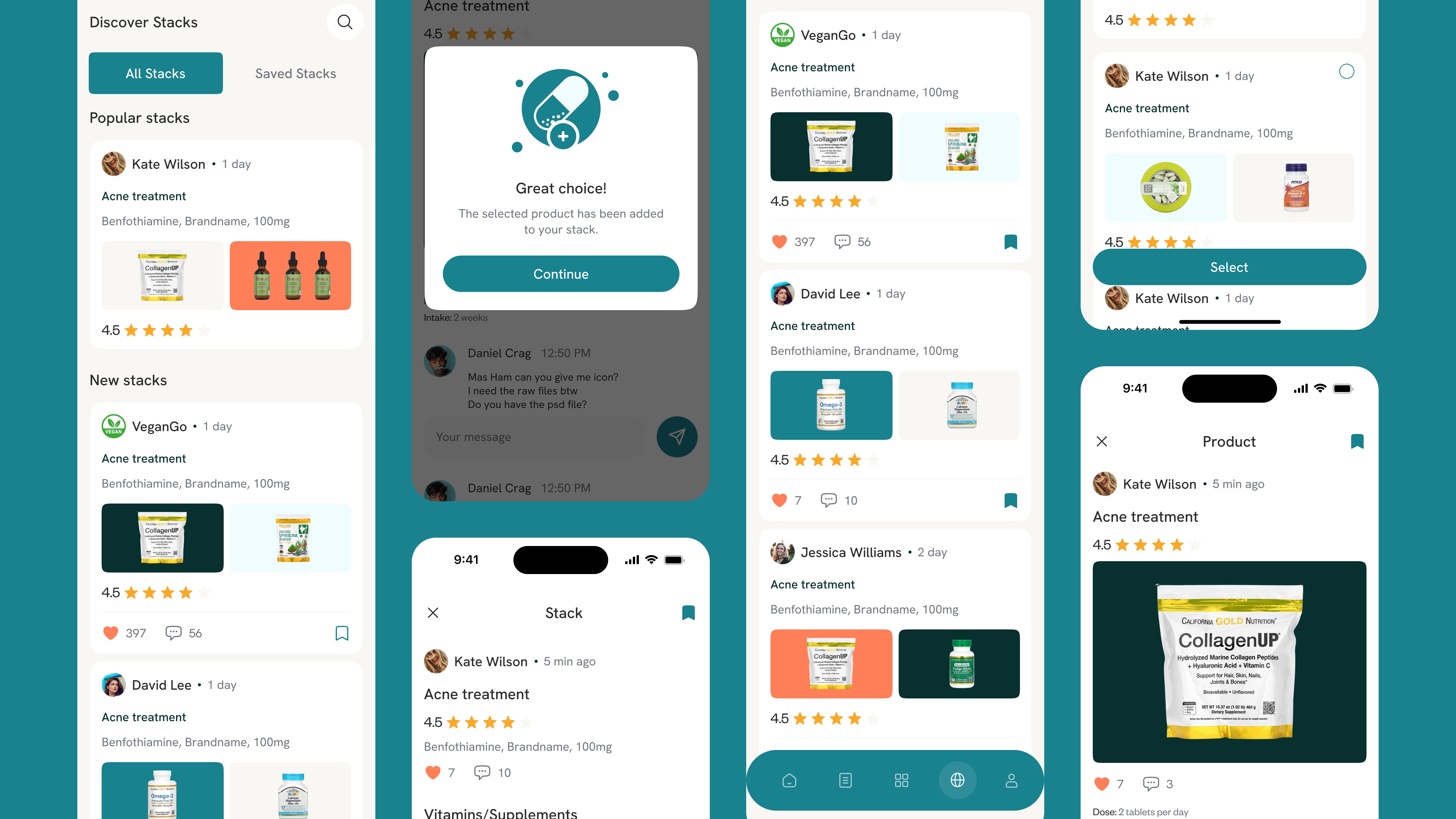
UX/UI Design for a Health & Supplement Social Platform

Lifestack sits at an intersection that hasn't been well-served digitally: people who take their health seriously, want to share what's working, and need access to credible information — all in one place. The client came with a clear MVP thesis: build the space where supplement stacks, medical Q&A, and genuine wellness conversation can coexist without devolving into noise.
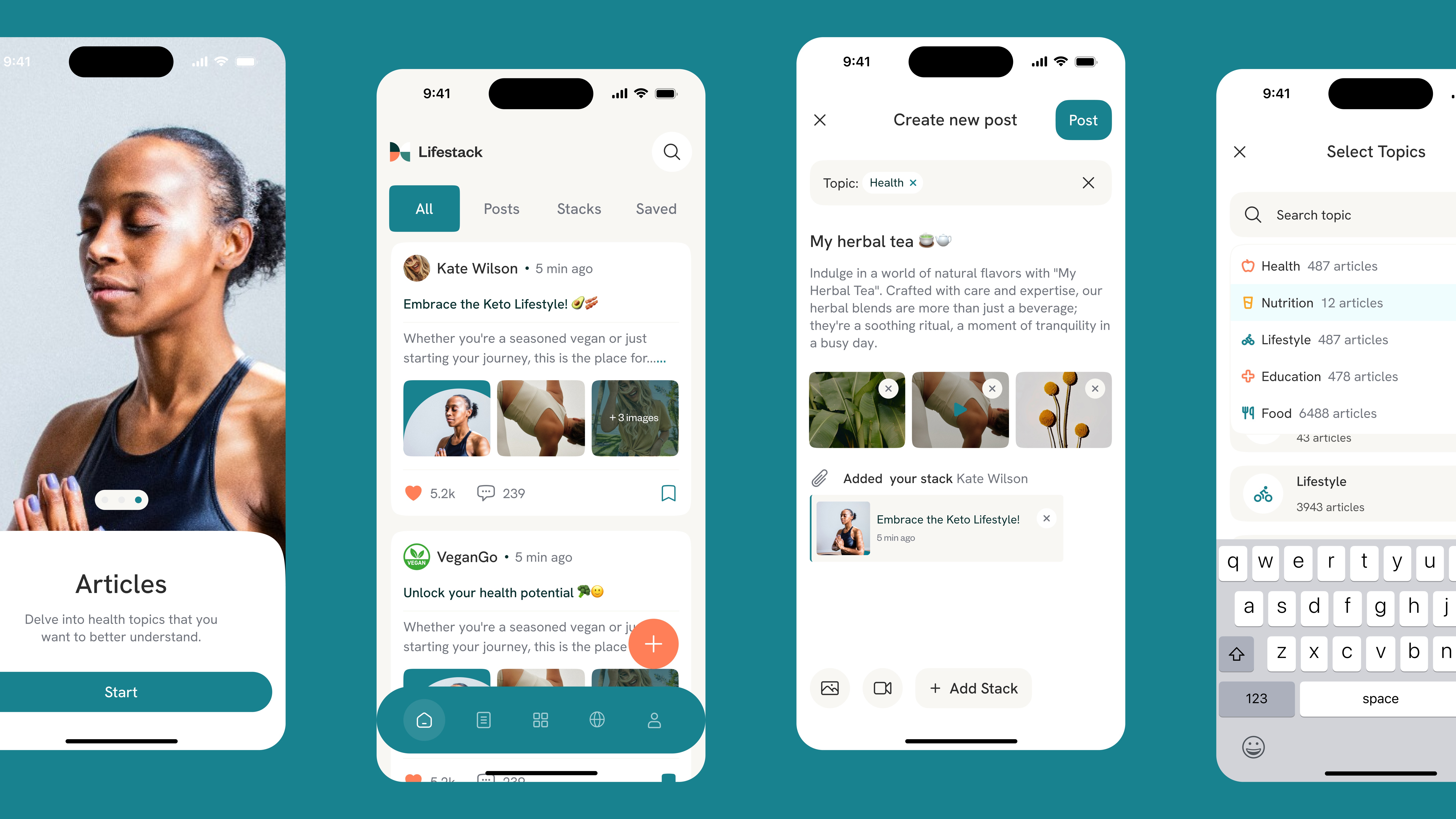
The design reference points were deliberate — Reddit's community logic, the familiarity of social feeds people already know how to navigate. The goal was zero learning curve. A 24-year-old tracking nootropics and a 58-year-old starting a wellness routine needed to open the same app and immediately feel at home.
Personal stacks became the core visual metaphor: a digital version of a bathroom shelf, intentionally curated. Users build, share, and track their supplement routines as a visible expression of their approach to health — not buried in a form, but front and center in their profile.
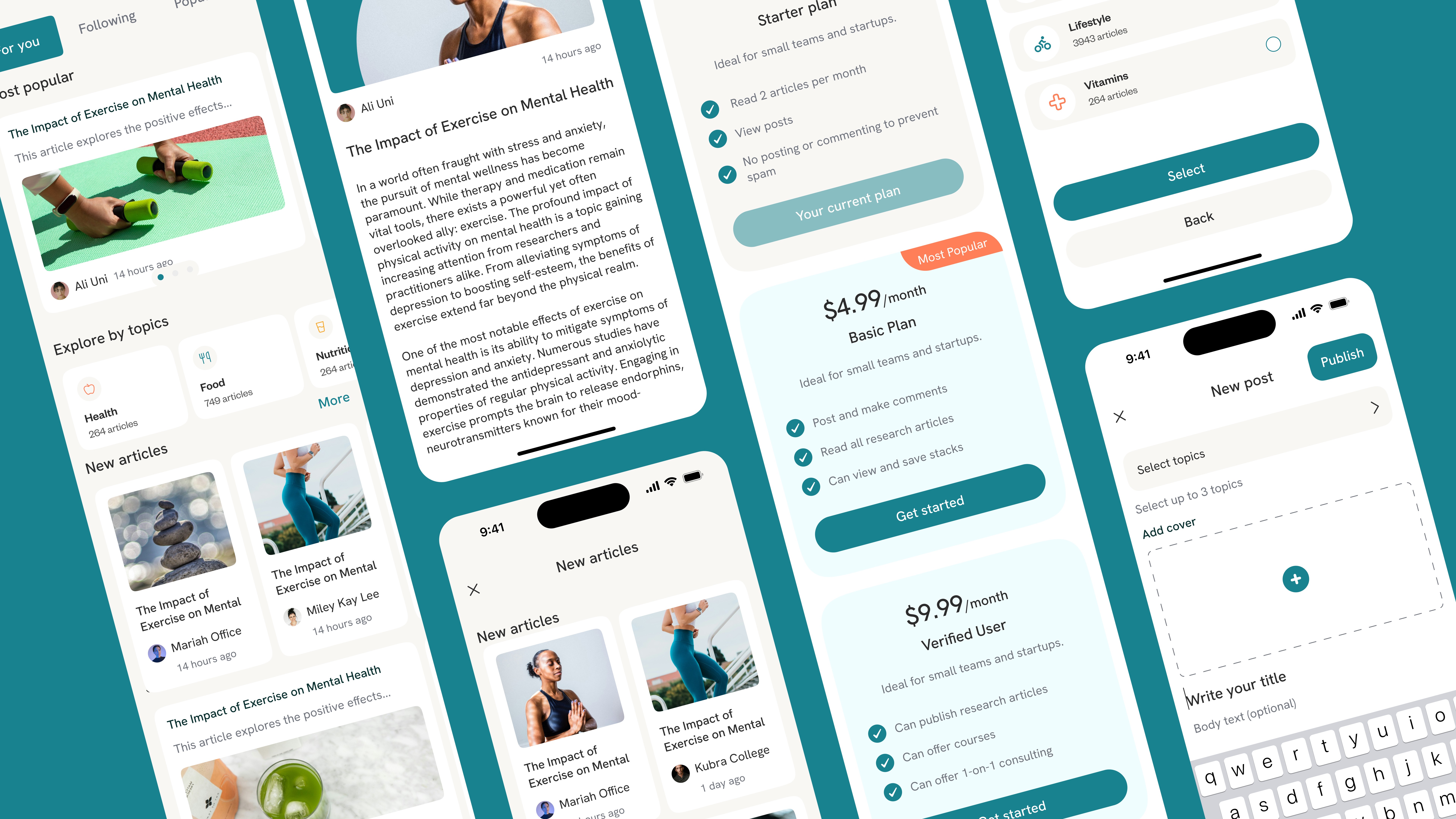
Community features — feeds, comments, Q&A — were designed around signal over volume. Gated expert content isn't a paywall mechanic; it's an editorial filter that separates peer experience from professional guidance, keeping both accessible without conflating them.
The color system breaks from the default wellness palette deliberately. Soft but distinctive — the kind of visual personality that makes the app recognizable in a category where everything tends toward the same muted greens and whites.
Lifestack launched as an MVP with the architecture to scale — communities, content subscriptions, practitioner access — without rebuilding the foundation.
More work
Contact
We keep things lean, clear, and responsive. Drop us a note — we’ll reply fast.