Client
BioWellth
Year
2026
Timeline
2 weeks
Services
Focus
Pre-launch wellness identity
BioWellth
Brand Identity & Logo Design for a Wellness App

BioWellth is a wellness mobile application sitting between MVP and pre-launch. We came into the project at a pivotal moment: the product worked, but wasn’t ready to be seen. Our engagement covered two connected surfaces: a UX audit and UI redesign of the iOS app, and a full brand identity development from the ground up.
The app helps users track wellness data, interact with an AI experience, and navigate personal health dashboards. The existing product had a functional foundation but lacked visual cohesion: inconsistent UI, friction in key flows, and a brand presence that didn’t reflect where the product was headed. The redesign addressed all three: targeted UX improvements, a complete visual overhaul, and clarified interaction patterns across dashboards, tracking, and the AI layer.
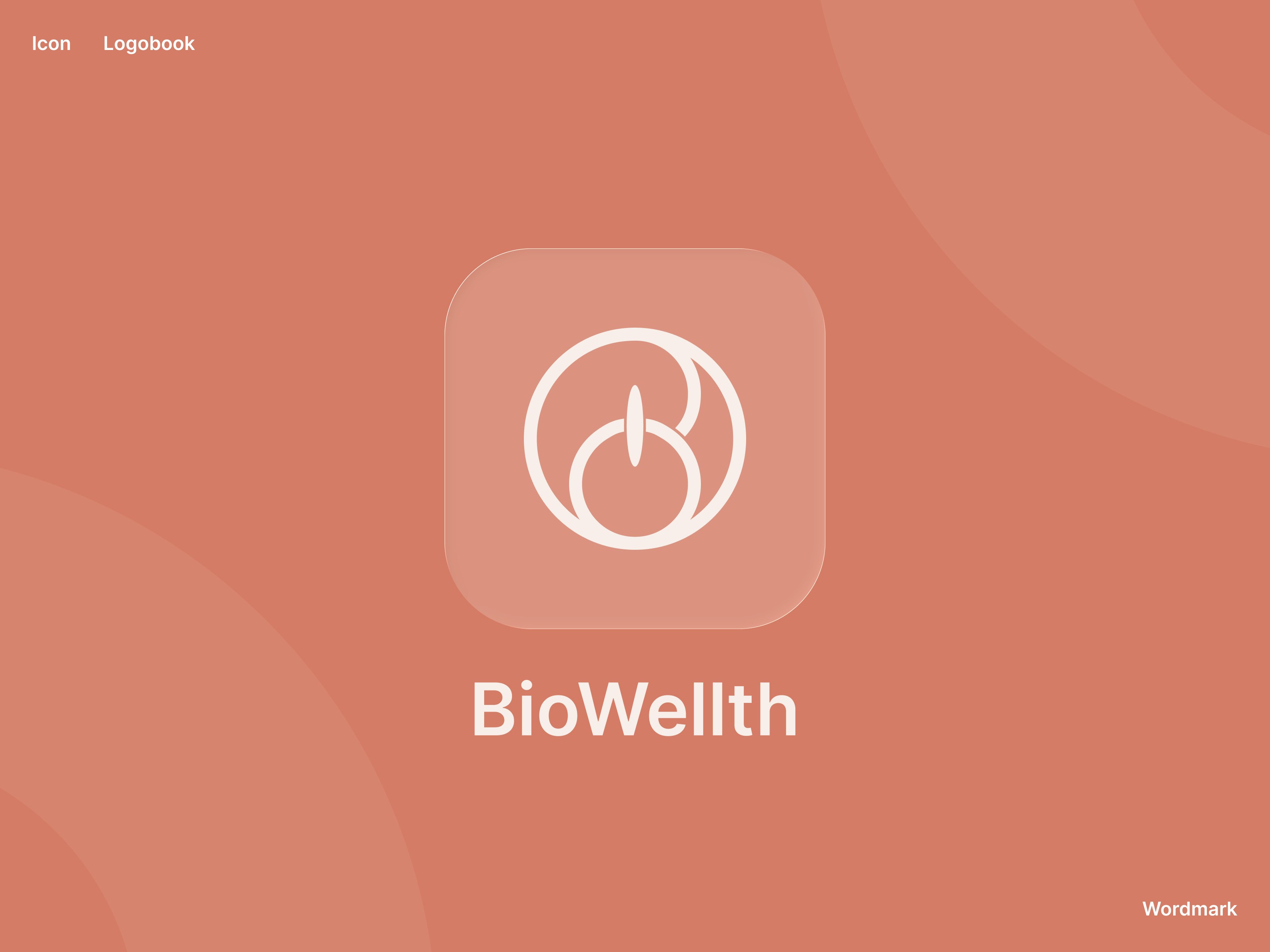
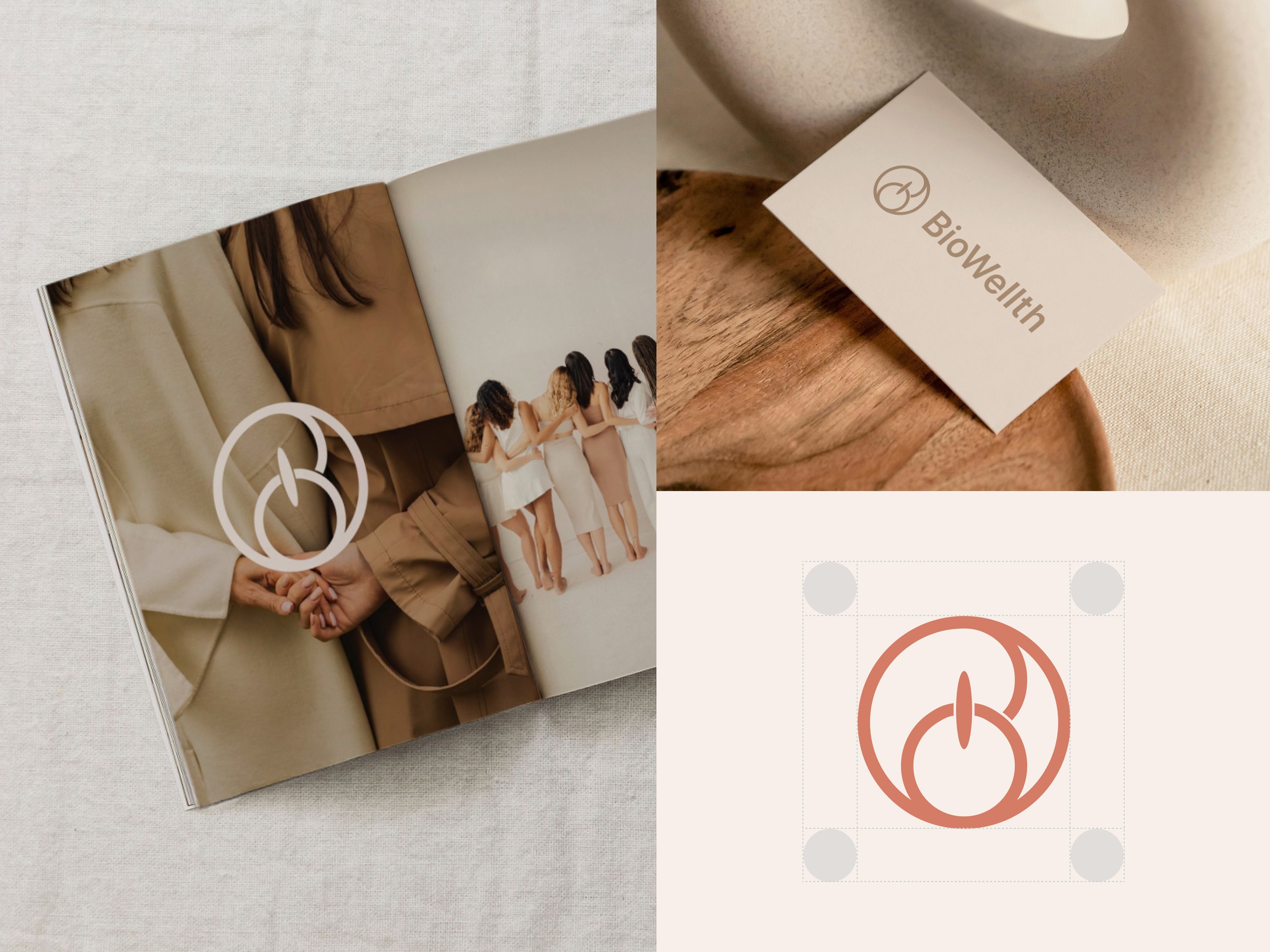
The brand identity work ran in parallel and followed the full process from brief to delivery. We started with a moodboard to align on visual direction: tone, references, emotional register. From there we developed multiple logo concepts, refined the strongest direction through rounds of iteration, and arrived at a final logo system that feels clean, confident, and distinctly wellness-oriented without leaning on category clichés.

The complete identity was assembled into a structured brand presentation and delivered as a full asset package, exported and organized on Google Drive, ready for the development team, marketing, and any future brand touchpoints. The logobook covers logo placement, color palette, typography, and usage guidelines.

The visual language across both the app and the identity shares the same foundation: soft wellness-inspired tones, structured layouts, strong typographic hierarchy, and calm spacing that communicates trust and stability. The brand and the product now feel like they belong to each other.
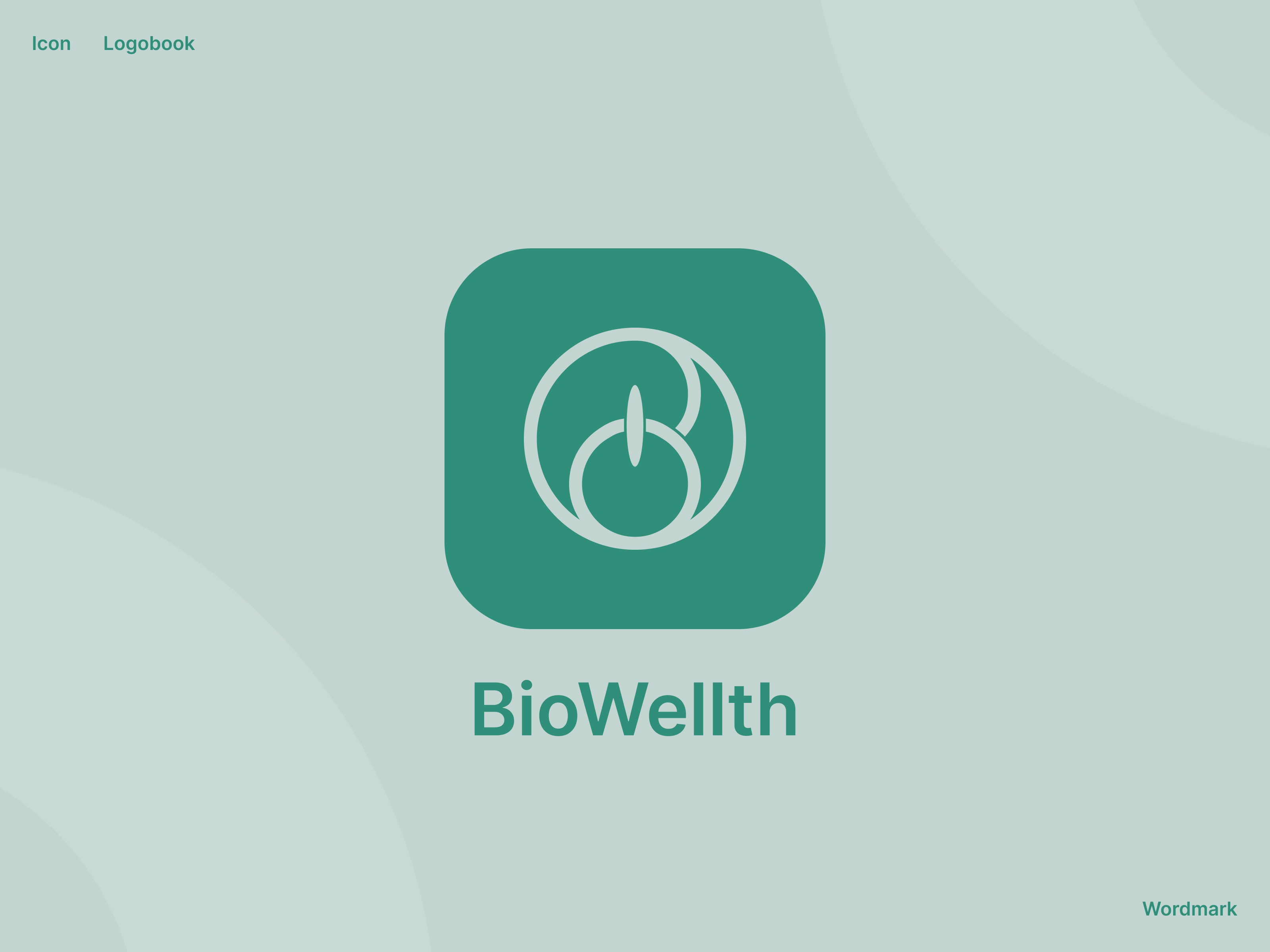
As a result, BioWellth moved from a functional but unpolished MVP to a launch-ready product with a coherent visual identity at its core. The logo and brand system gave the product a clear, confident face — one that aligns with its positioning in the wellness space and holds up across every touchpoint.
Combined with the UI redesign, the app now communicates trust and clarity from the first interaction, which is exactly what a pre-launch wellness product needs to earn before it asks anything of its users.

More work
Start Project
Have a product, brand, or website to improve? Tell us what you’re building — we’ll reply within 24 hours.