Client
Plus Ultra
Year
2025
Timeline
3 weeks
Services
Website Design
Plus Ultra
Landing Page Redesign for a Trail Running Brand

The original landing page worked. It was clean, navigable, and completely forgettable. A user could scroll through it in under a minute and retain nothing about the brand. For a company built around community, movement, and energy — that was the real problem.
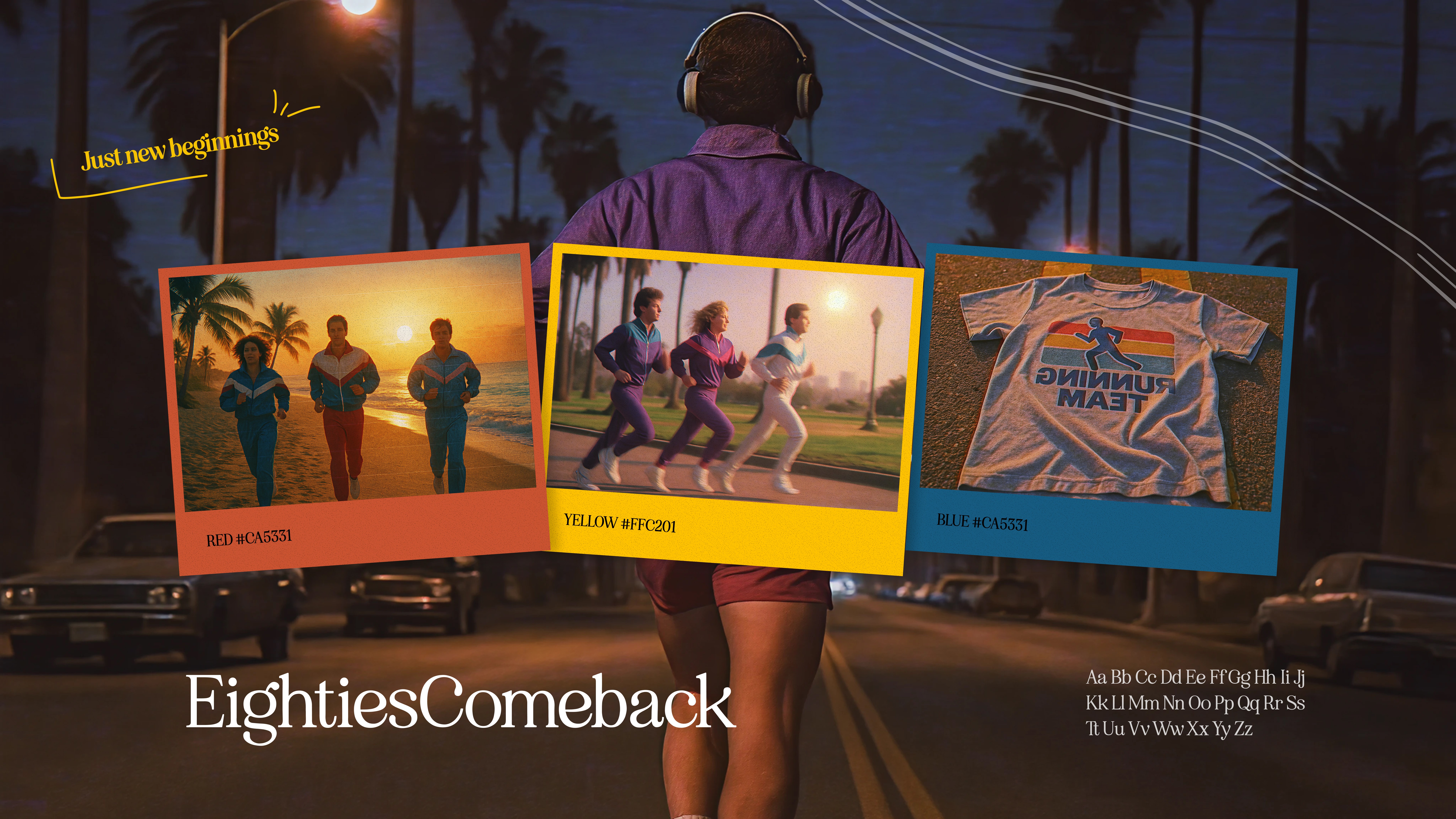
The redesign pulls from the 80s: bold poster typography, warm muted tones, grainy textures, polaroid-style framing. Not as a random aesthetic call — the era's visual language maps directly onto what Plus Ultra stands for. Freedom, optimism, the physicality of being outside. The nostalgia isn't decorative; it's the brand's personality finally made visible.
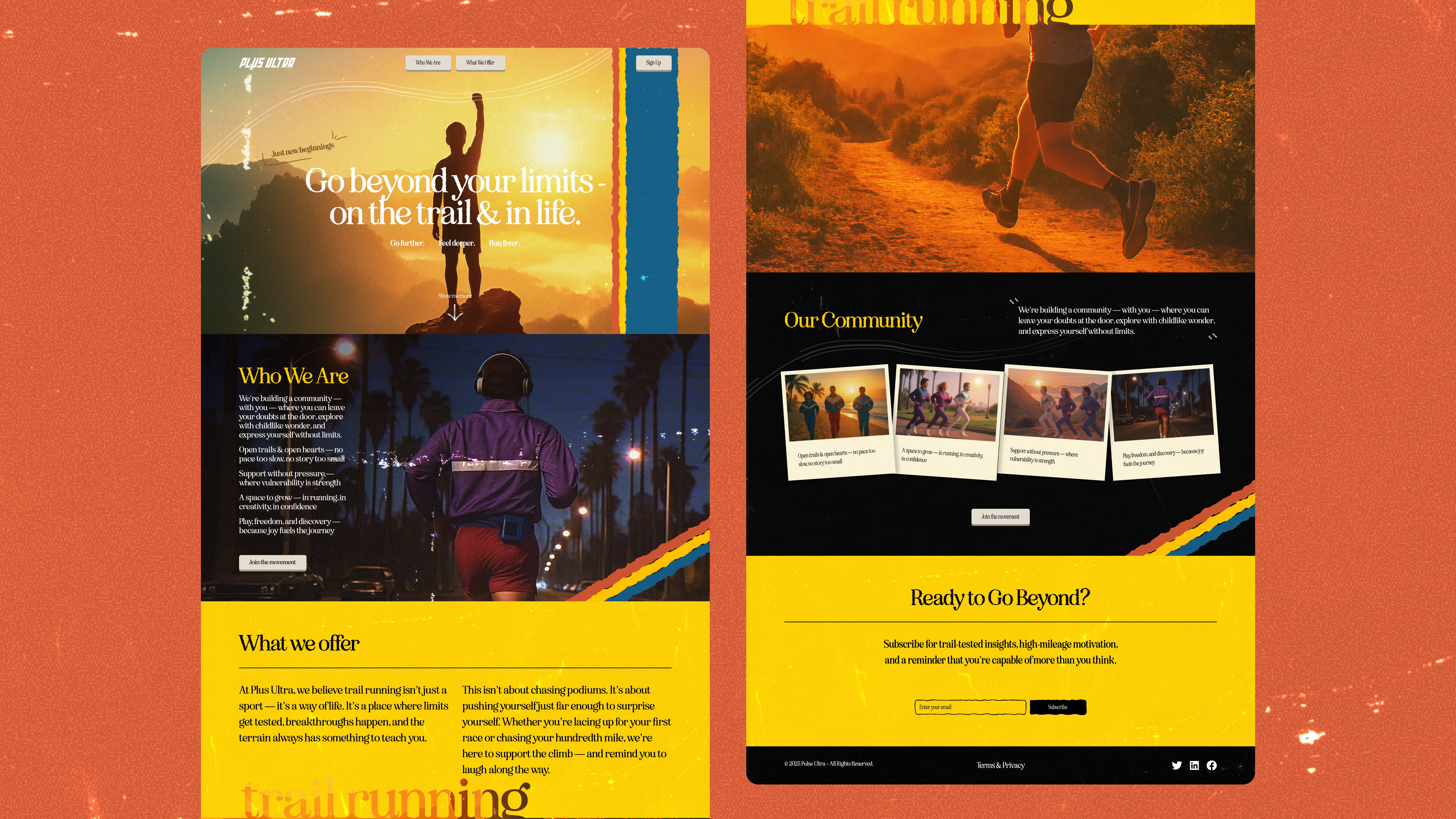
Every section was rebuilt from scratch. The hero has a cinematic weight. Community moments are framed like polaroids — giving user-generated content the feeling of something worth keeping. The color palette places you immediately: orange sunsets, film grain, the warmth of analog photography. Bold retro typography sets the pace throughout.
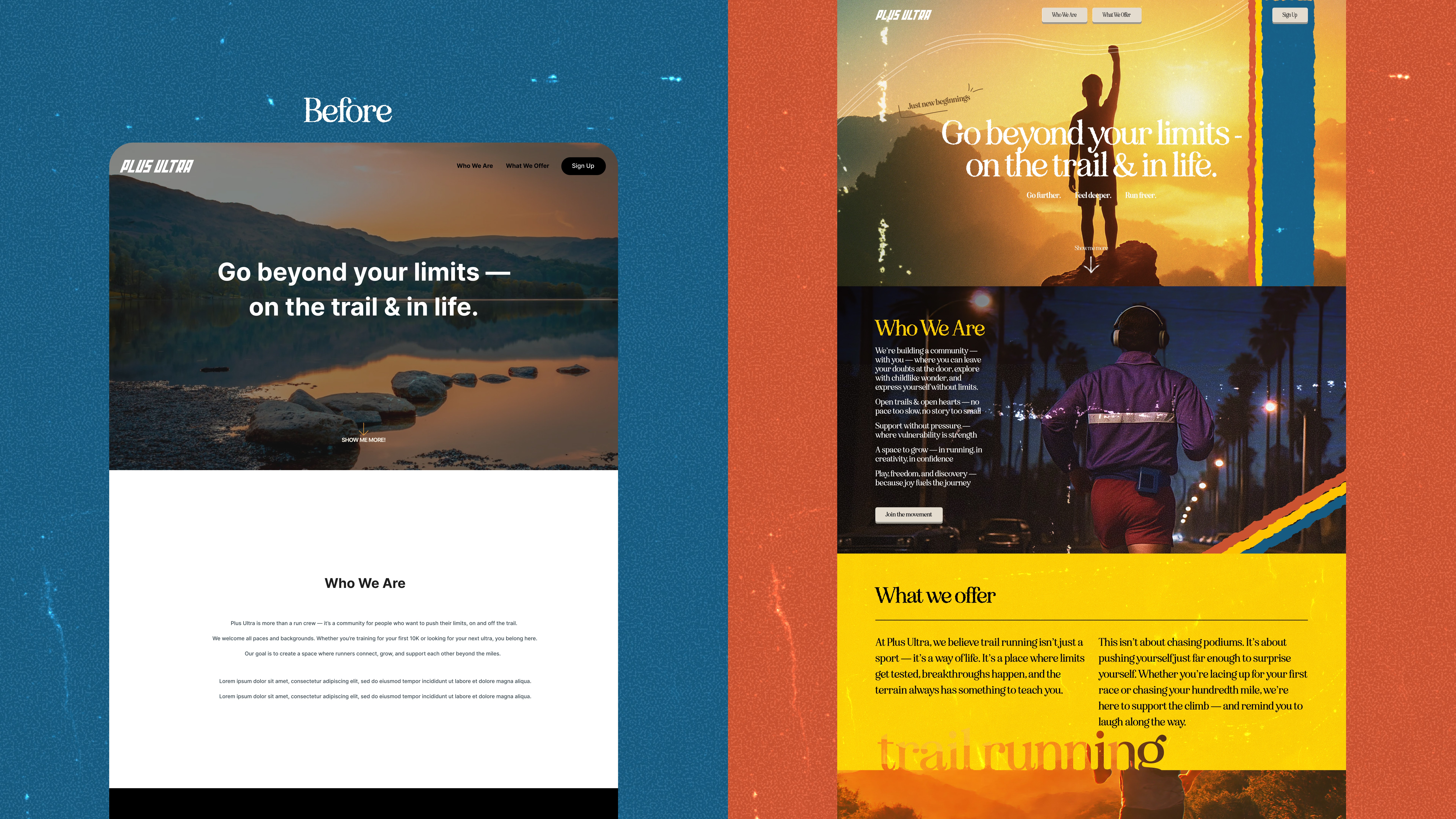
The result is a landing page that reads like a trail running magazine from 1987, designed to convert in 2025. Users don't just see a product — they step into a world. That's the difference between a page people scroll past and one they remember.
More work
Contact
We keep things lean, clear, and responsive. Drop us a note — we’ll reply fast.