Client
Beyond Energized
Year
2024
Timeline
4 weeks
Focus
Health platform launch
Beyond Energized
UX/UI Design for a Health & Nutrition Platform
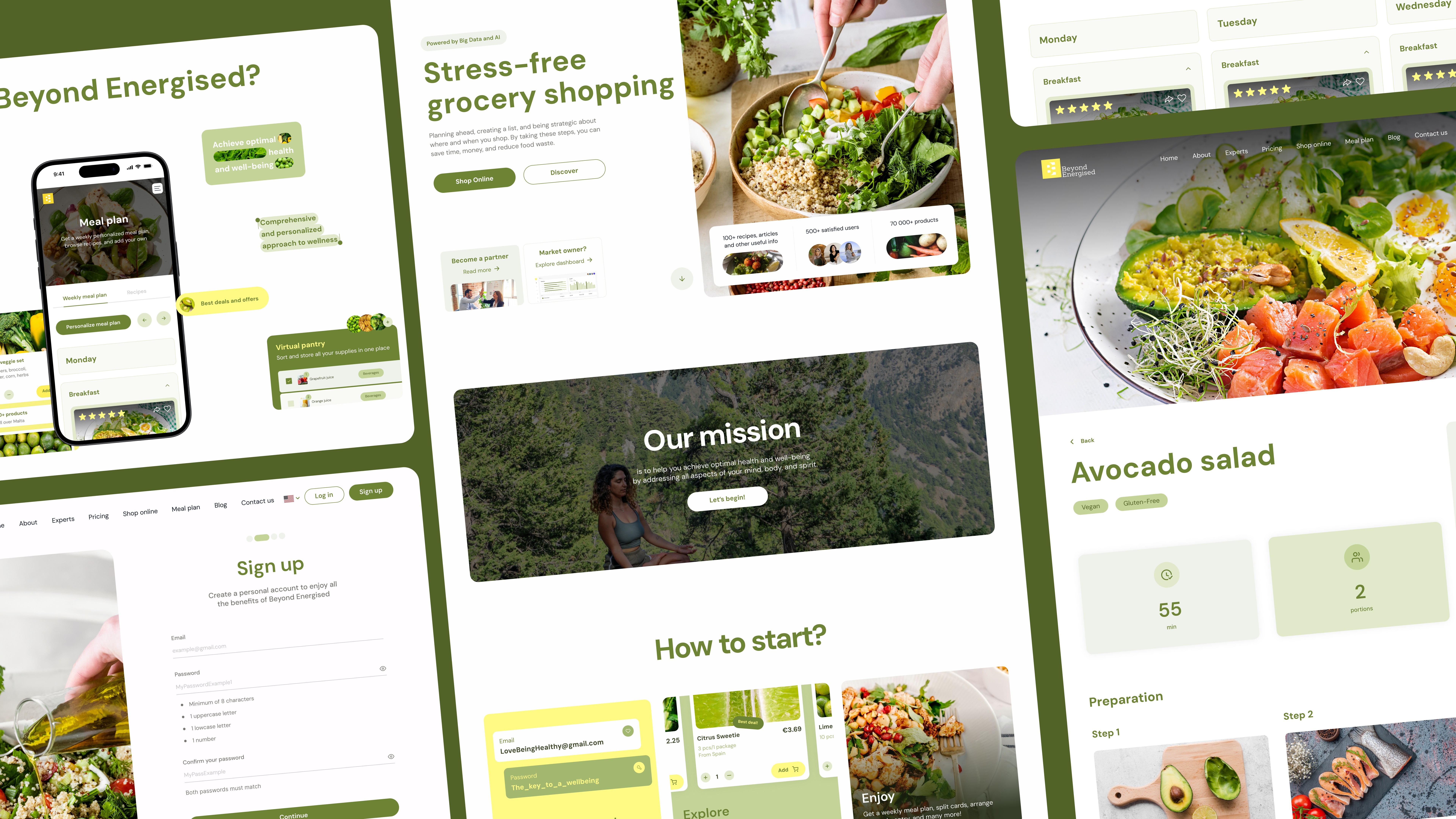
Beyond Energized started as an MVP with a clear conviction: eating well shouldn’t require effort, planning expertise, or a full fridge audit every Sunday.
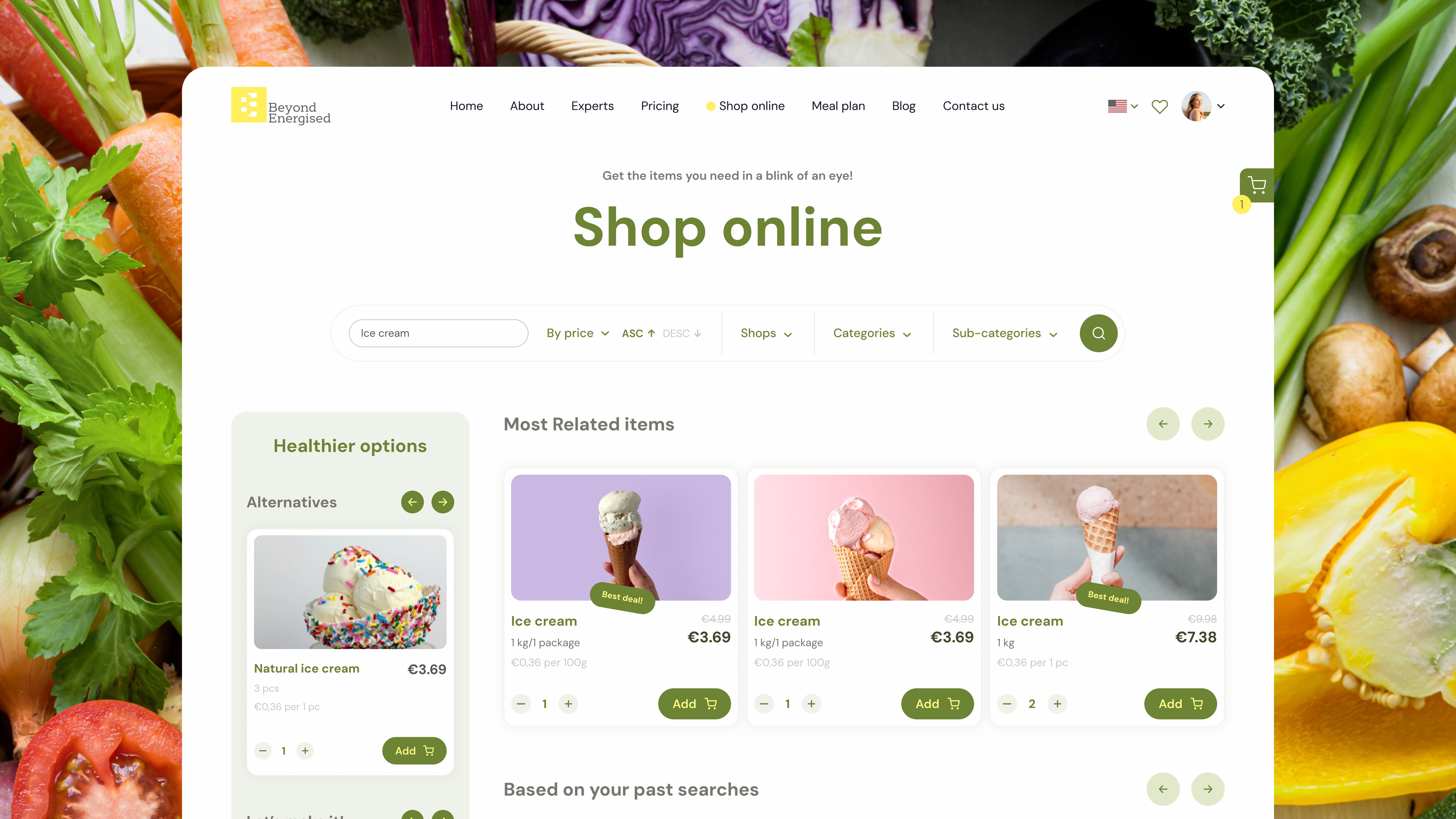
The team came to us to take that idea further — from a working prototype to a scalable platform ready for users, nutritionists, and investors.
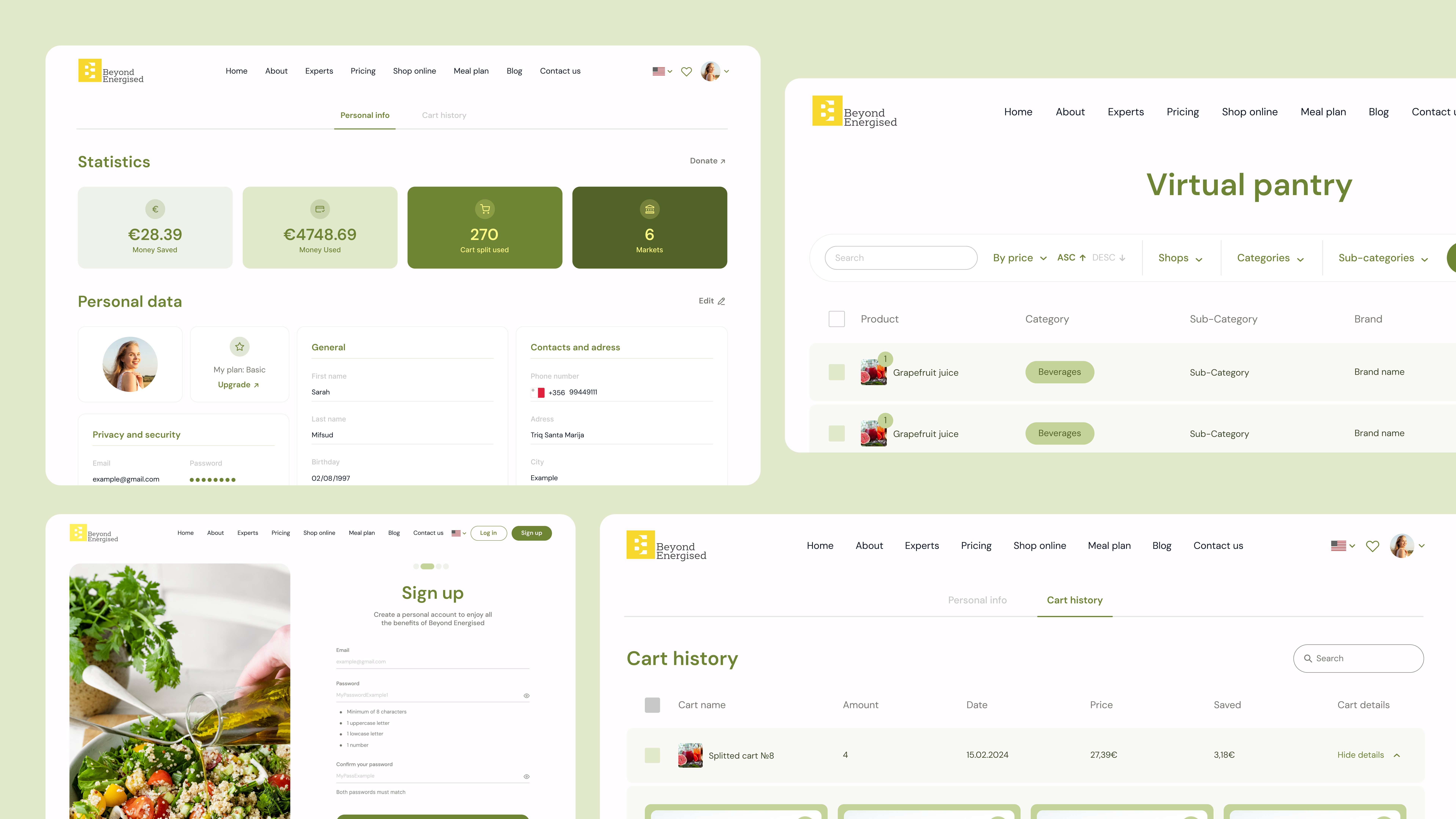
The core design problem wasn’t aesthetic. It was behavioral. People abandon healthy habits not because they lack intention, but because the tools make it feel like work. Every decision we made — architecture, flow, visual language — was tested against one question: does this make the next step easier or harder?
The platform serves two distinct user types, and both needed their own logic. For end users: an intuitive system for building grocery baskets, following nutritionist-curated meal plans, and tracking progress without friction. For nutrition experts: a publishing and client management layer — blogs, recipes, consultations — that supports their personal brand alongside the platform itself.
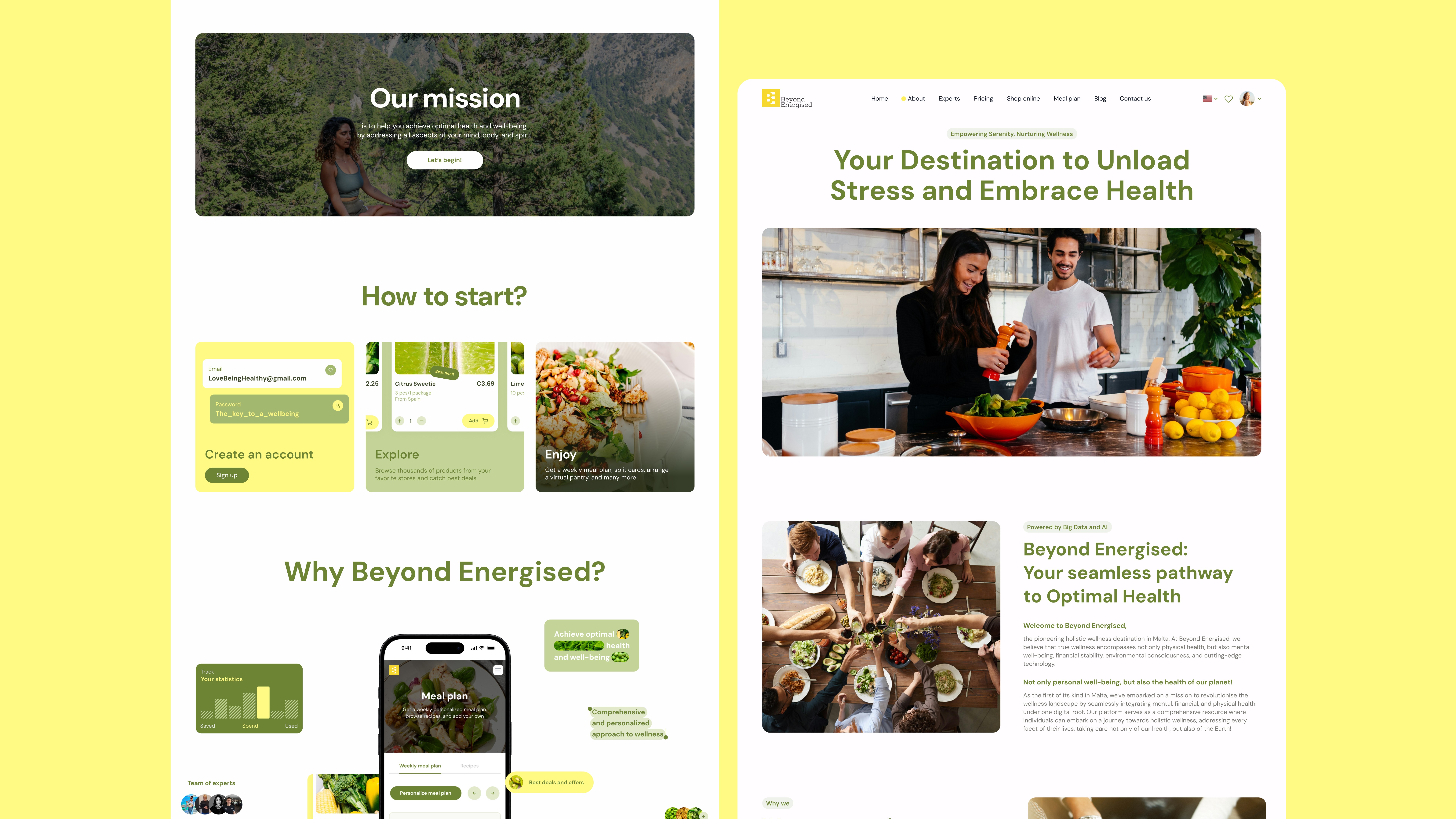
The landing page was built as an entry point into a community, not a feature list. SEO structure and content hierarchy work together: organic traffic lands on a page that reads clearly, moves naturally toward signup, and communicates the product’s value before asking anything of the user.
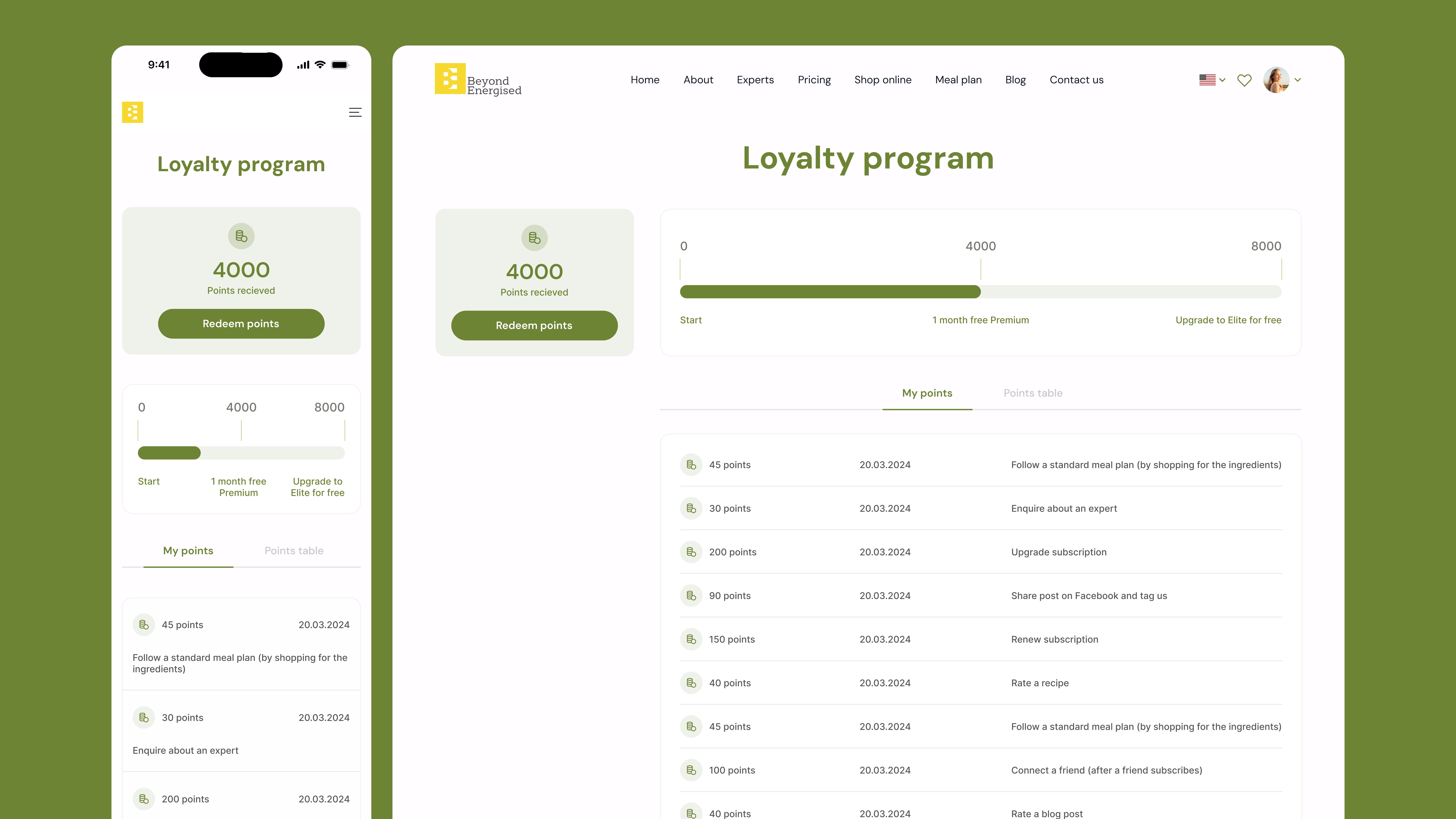
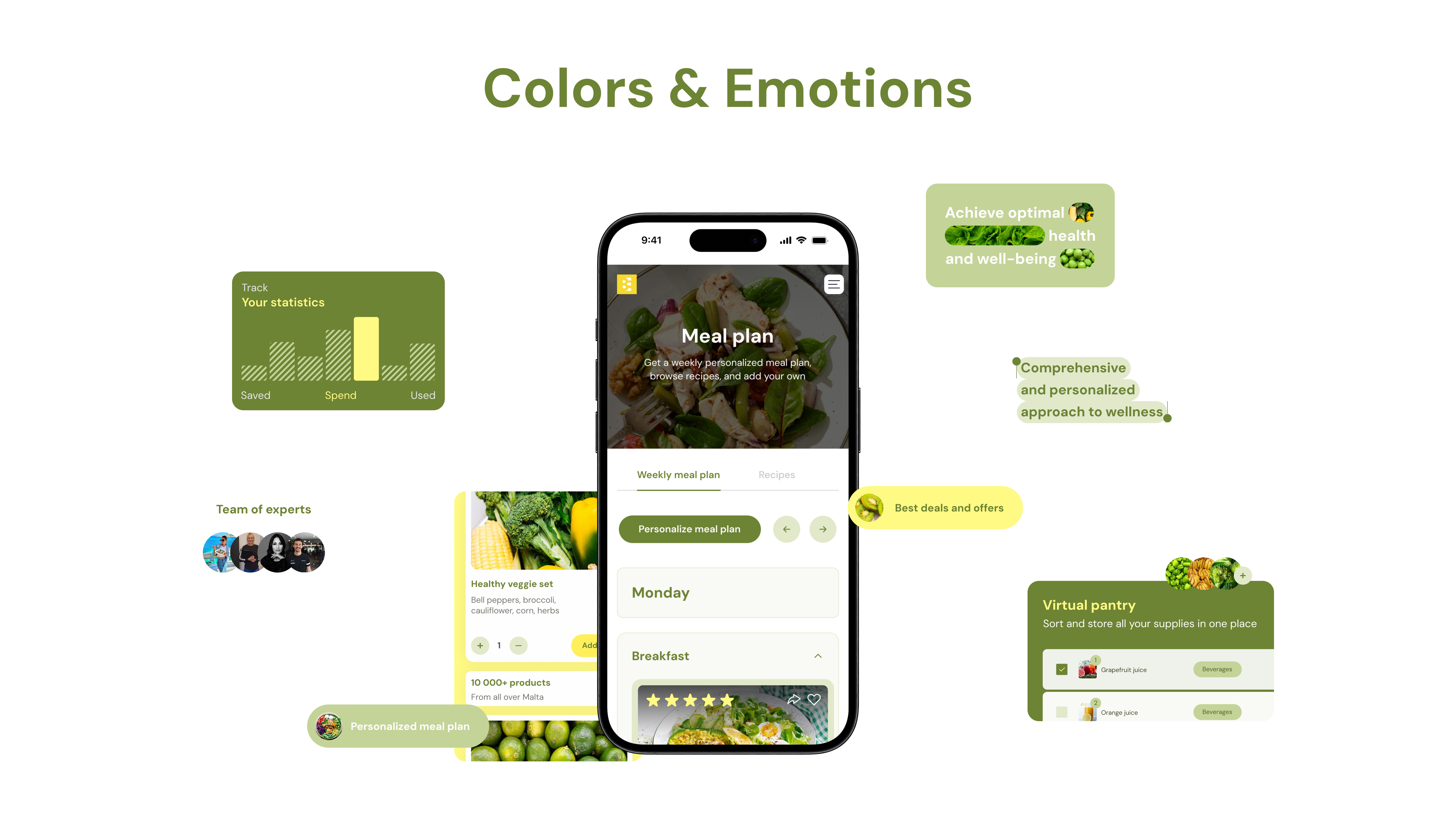
Green and yellow carry the emotional register throughout — balance and trust on one side, energy and optimism on the other. The palette does quiet work: users feel at ease in the product before they consciously notice why.
What launched was no longer an MVP. Beyond Energized now has a coherent digital ecosystem — platform, landing page, and visual identity — built to support habit formation and scale alongside the business.

More work
Start Project
Have a product, brand, or website to improve? Tell us what you’re building — we’ll reply within 24 hours.