Client
BioWellth
Year
2026
Timeline
5 weeks
Focus
AI-powered wellness app launch
BioWellth — Wellness App UX Audit & Redesign
From MVP to launch-ready: UX audit, mobile app redesign, AI experience design and brand identity for an AI-powered wellness product.
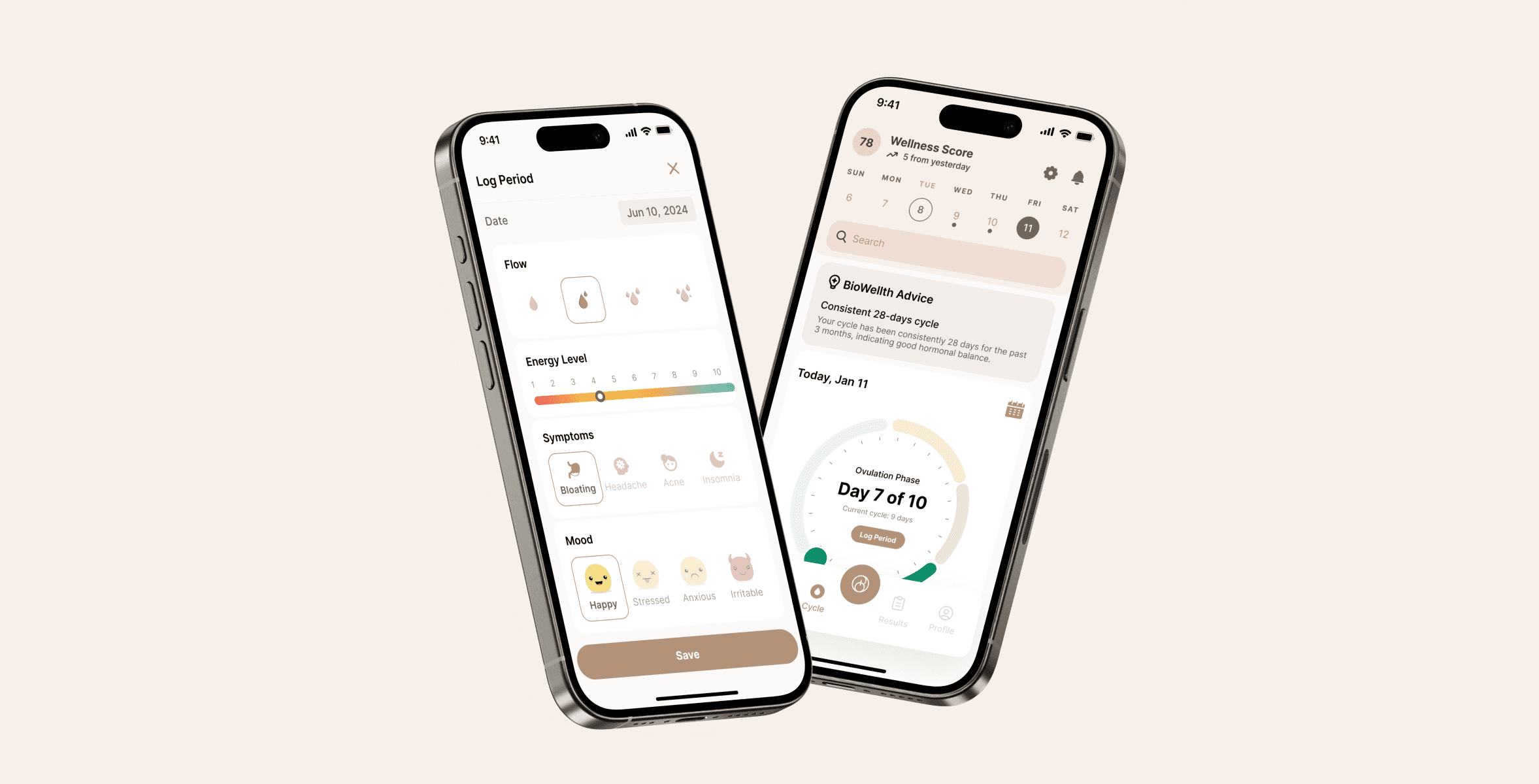
BioWellth is an AI-powered wellness mobile application positioned between MVP and pre-launch. When the team came to us, the product already had a solid functional base, but it needed a clearer user journey, stronger visual identity, and a calmer product experience before going to market.
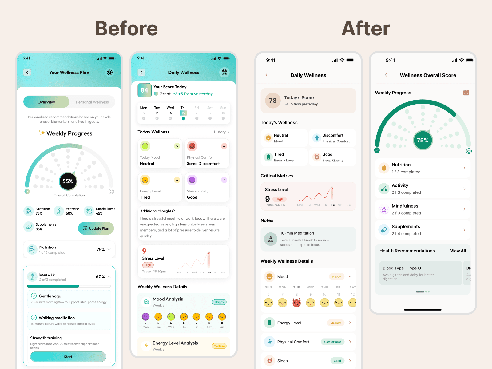
The goal was not to rebuild the app from scratch. The priority was to audit what already existed, identify the product and UX issues that could affect adoption, and redesign the experience so users could understand wellness data, tracking flows, and AI-driven guidance with less friction.
We started with a comprehensive UX audit of the iOS app, approaching it from a power-user perspective. This helped us identify friction points, unclear interaction patterns, inconsistencies in the interface, and moments where complex health and wellness information needed better hierarchy. Together with the client, we prioritized the changes that would have the biggest impact on clarity, usability, and engagement.
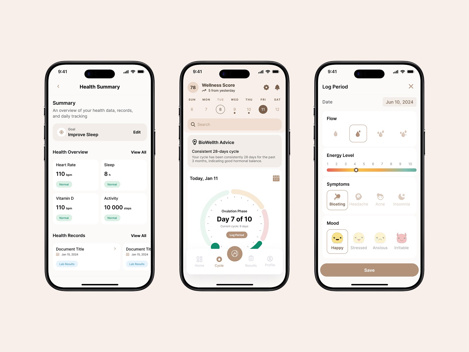
From there, we moved into a focused mobile app redesign phase. We refined core user flows, improved the clarity of interactions, and redesigned the interface to feel more cohesive and structured. Special attention was given to wellness dashboards, symptom and tracking features, onboarding moments, and the AI-powered experience so that complex information felt easy to understand and act on.
At the same time, we refreshed the brand identity and visual system. The goal was to make BioWellth feel calm, trustworthy, modern, and ready for launch. We improved the logo direction, strengthened consistency across screens, and shaped a product language that could support future marketing, development, and investor-facing materials.
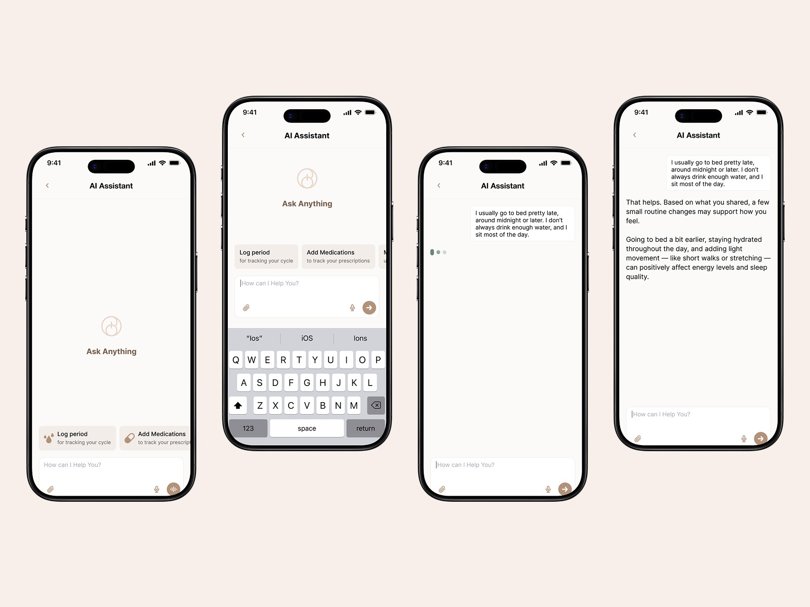
Visually, the updated direction balances warmth and structure. Soft wellness-inspired tones are combined with clear layouts, readable typography, and thoughtful spacing, creating an interface that feels calm, reliable, and easier to use.
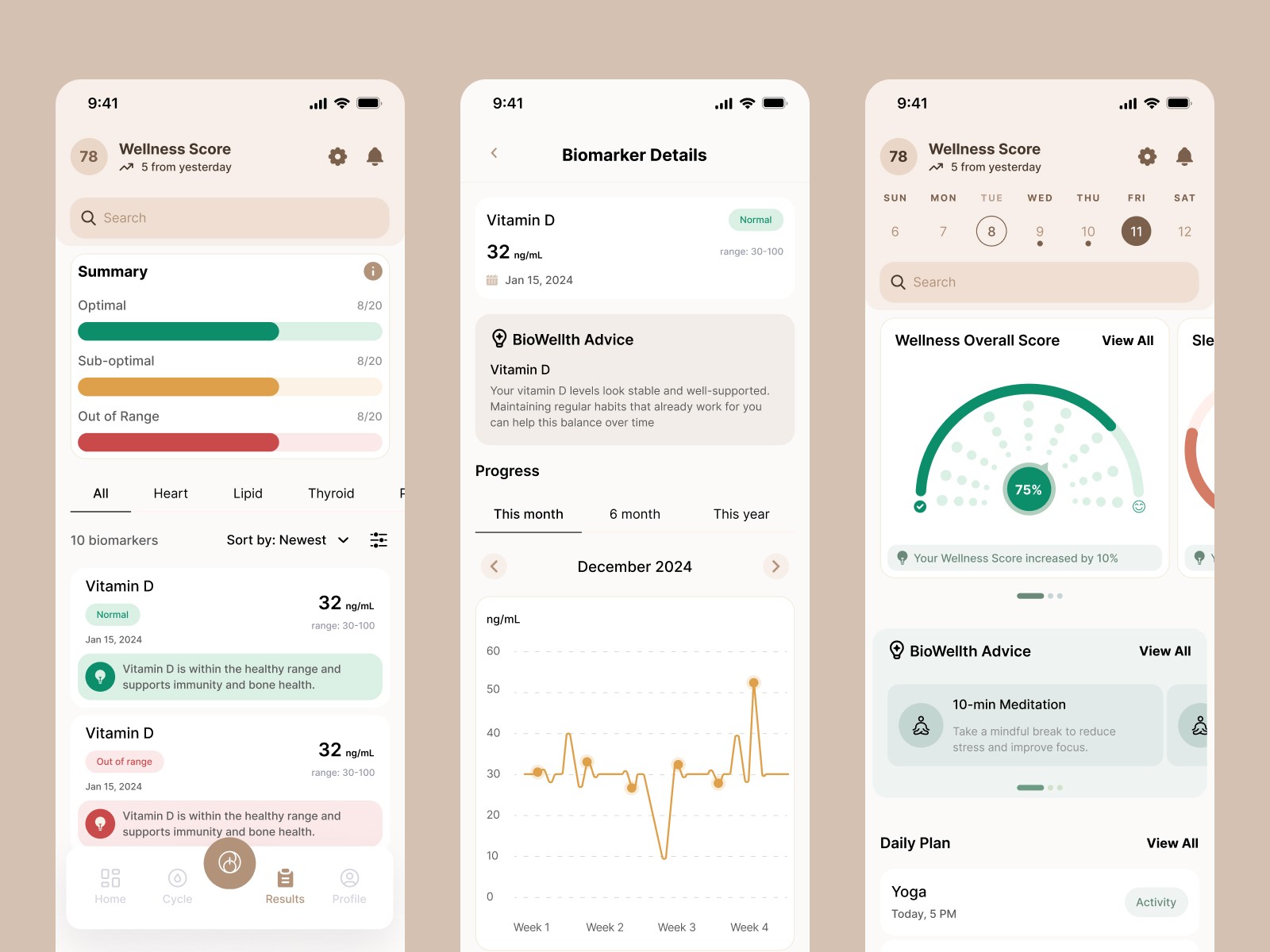
The result is a product that moved beyond its MVP stage into a more polished, launch-ready experience. BioWellth now has a clearer user journey, stronger brand identity, more consistent mobile UI, and a more engaging AI wellness experience.
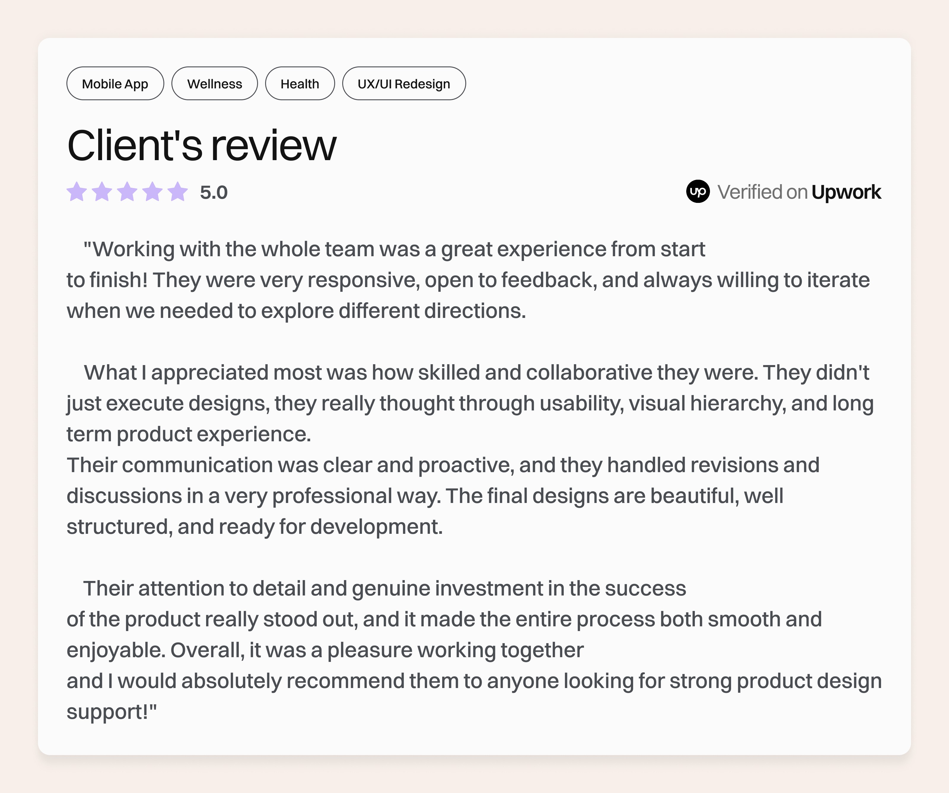
The redesign not only improved usability but also helped position BioWellth as a credible, modern wellness product ready to scale in a competitive healthtech market.

More work
Start Project
Have a product, brand, or website to improve? Tell us what you’re building — we’ll reply within 24 hours.