Client
Piano Pilgrims
Year
2024
Timeline
3 weeks
Services
Focus
Music Learning App Design
Piano Pilgrims — Piano Learning Game App
Mobile App Design for a Piano Learning Game

Piano Pilgrims is a mobile learning app that teaches children to play piano through structured courses, challenges, and progress tracking. The brief was specific: make music education feel like a game without making it feel unserious. Children need engagement; parents need to see real progress.

The experience is built around a unit-based course structure. Each unit groups lessons by skill level, with clear completion states and progress indicators that make advancement visible and satisfying. The “Musicianship” module tracks completed lessons, course milestones, and payment confirmations in a single feed — keeping both the student and their parent oriented at a glance.
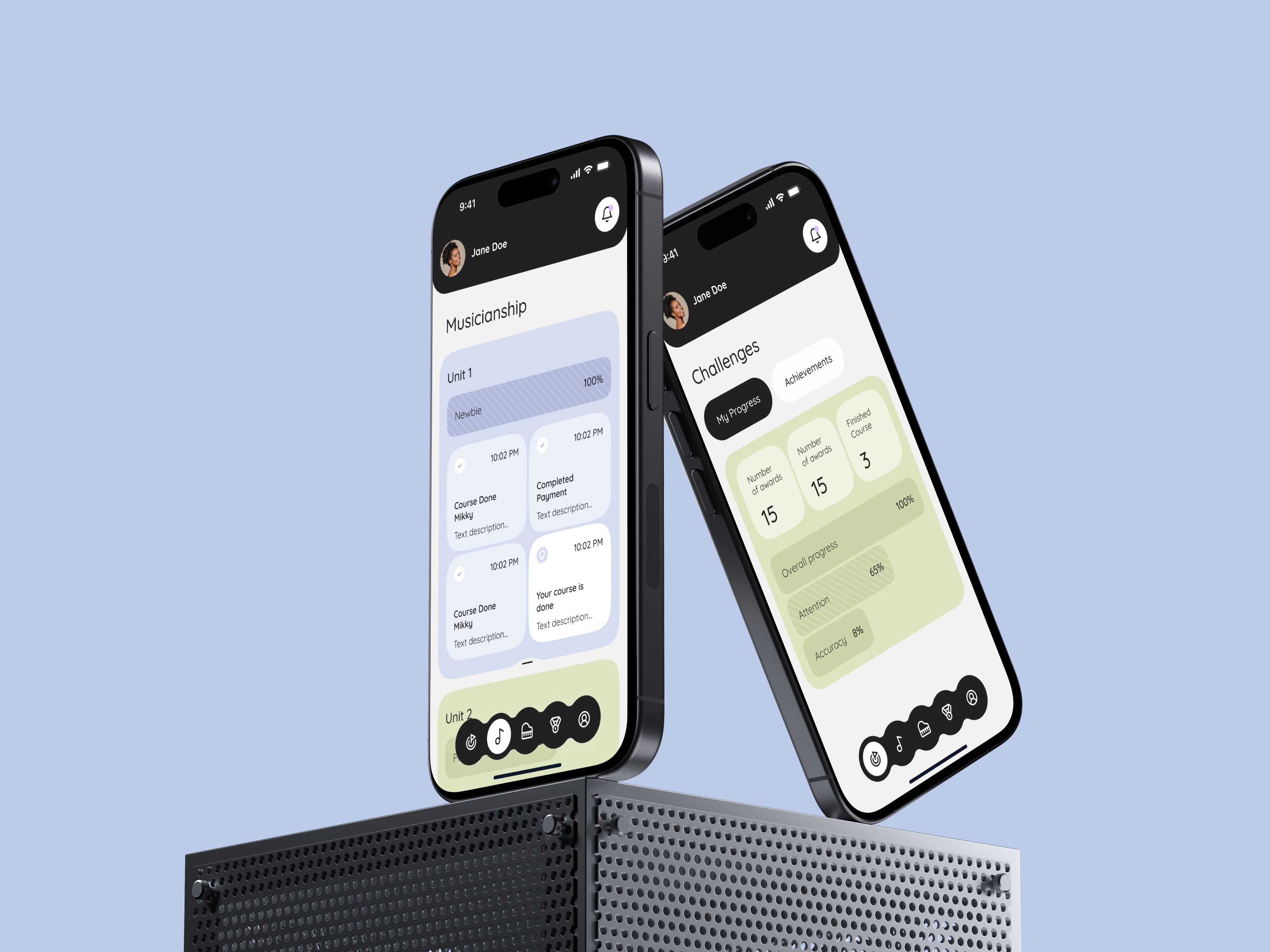
The Challenges section adds a game layer on top of the learning structure. Users track awards earned, courses finished, and skill metrics — attention and accuracy — through a clean progress dashboard. Achievements sit alongside progress, giving children something to collect and parents something concrete to point to.

The visual language is calm and considered for a children’s product: sage green, soft lavender, and warm off-white replace the saturated primaries most EdTech apps default to. The palette feels fresh without being overstimulating — the kind of interface a child can spend time in without a parent feeling uncomfortable about the screen time.
Navigation uses an icon-based bottom bar with clear category icons for practice, lessons, challenges, rewards, and profile. Each section is visually distinct but part of the same system. The login screen introduces a split between a dark lower half and a soft lavender upper half — a small detail that makes the entry point feel considered rather than generic.

More work
Start Project
Have a product, brand, or website to improve? Tell us what you’re building — we’ll reply within 24 hours.