Client
Xchainger
Year
2025
Timeline
2 weeks
Services
Focus
Trust-first crypto identity
Xchainger
Logo & Brand Identity for a Proprietary Crypto Trading Company

Xchainger is a proprietary crypto-asset trading company operating exclusively with its own corporate capital on approved centralized marketplaces. The business model is precise and regulated: own name, own account, own risk. The brand identity needed to reflect exactly that — no excess, no noise, nothing that overpromises.
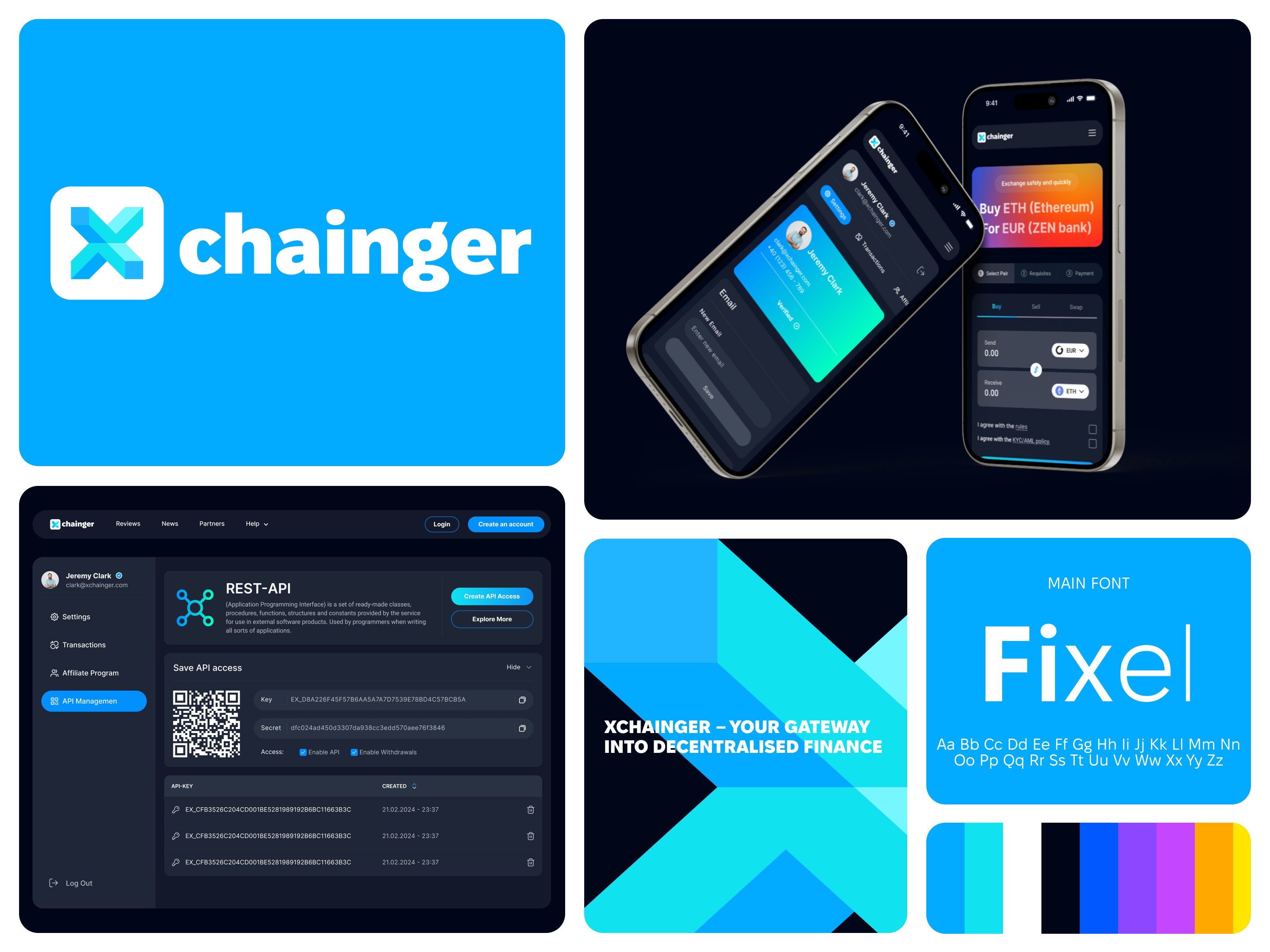
The task was a logo and full style guide, aligned with both client direction and current design trends in the fintech and crypto space. In a category where visual language tends toward either aggressive tech maximalism or generic financial conservatism, the goal was to land somewhere more considered: modern, professional, and distinctly Xchainger.
The logo development followed the full process: direction alignment, concept exploration, refinement, and final mark. The result is a clean, confident logo system built for a company that operates with precision and needs its identity to communicate the same.
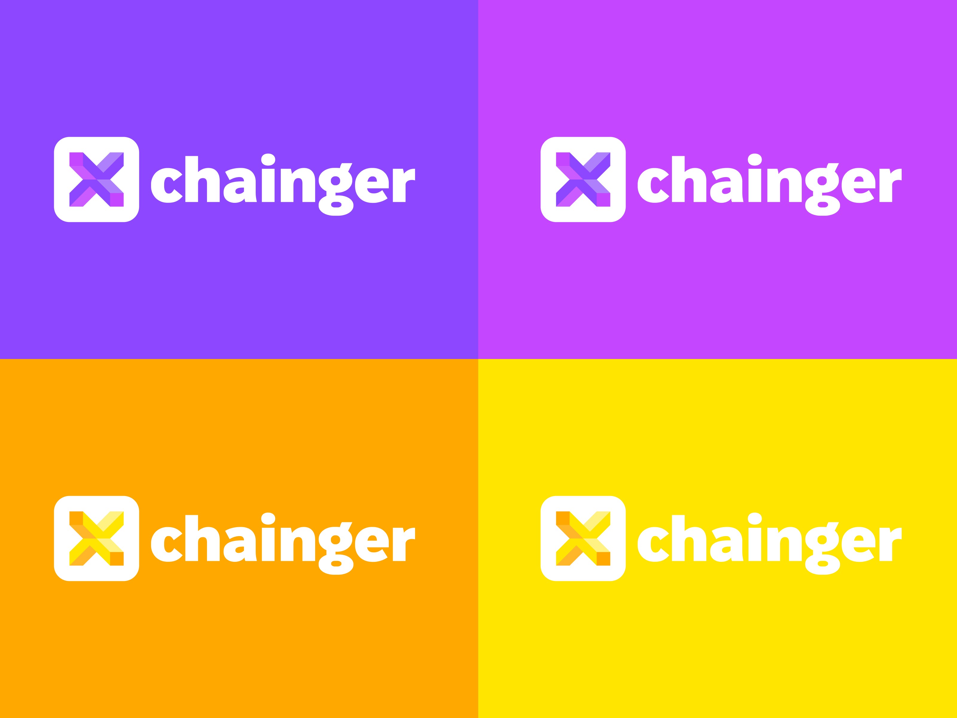
The style guide extends the mark into a complete visual language: color palette, typography, spacing rules, and application guidelines across digital touchpoints. Every element was chosen to reinforce credibility and clarity — the two qualities that matter most when trust is the product.

The delivered system is ready to scale: consistent across the web presence, documents, and any future brand touchpoints as the company grows.

Related services: Startup Branding Agency and SaaS Product Design Agency.
More work
Start Project
Have a product, brand, or website to improve? Tell us what you’re building — we’ll reply within 24 hours.