Client
Kaizen Hydration
Year
2026
Timeline
2 weeks
Focus
Shopify Product Page Design
Kaizen Hydration
Conversion-Focused Product Page Design for a Wellness Brand

Kaizen is a US-based wellness brand selling premium electrolyte supplements built around a clean, no-filler formula — microplastic-free rock salt, magnesium glycinate, organic sea moss, taurine. The brand operates on Shopify in a saturated supplement market where nearly every competitor's product page looks identical. The brief was a high-converting PDP that could make Kaizen's actual differentiation visible before a buyer scrolls past it.
The core problem wasn't the product — it was that the page wasn't communicating what made it worth choosing. Ingredient quality, sourcing transparency, and the absence of fillers were all there, but buried in the way most supplement brands bury them: supplement facts panel, generic benefit bullets, stock imagery. A health-conscious buyer who reads labels needed to see that information before they had to look for it.
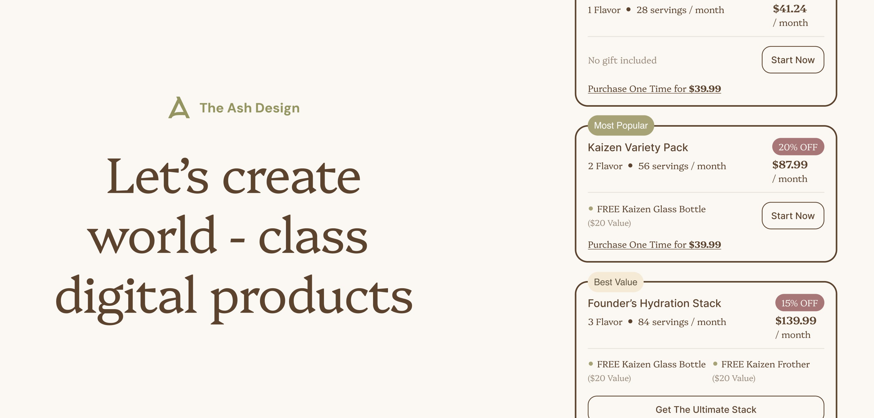
We structured the page around the buyer's actual decision sequence: what's in it, why it matters, whether the brand is credible, and how to get it. Ingredient transparency moved to the foreground. Trust signals and social proof were positioned to intercept hesitation before it becomes exit intent. The subscribe-and-save offer — 25% off for life — was given the visual weight it deserves as the primary conversion driver.

The visual hierarchy gives the product room to lead. The CTA stays consistently visible throughout the scroll without competing with the content around it. The page works on both desktop and mobile without the experience degrading on smaller screens.
The result is a product page that matches the quality of the product itself — clear, credible, and built to convert a buyer who expects a brand to earn their trust before asking for their money.
More work
Start Project
Have a product, brand, or website to improve? Tell us what you’re building — we’ll reply within 24 hours.