Client
Mykonos Yachts
Year
2025
Timeline
2 weeks
Services
Web Design
Focus
Luxury WordPress visual refresh
Mykonos Yachts
Website UX/UI Redesign

Mykonos Yachts is a luxury yacht charter company based on the island of Mykonos, offering premium day cruises, multi-day charters, and a curated fleet of high-end yachts. The brand is built around exclusivity, elegance, and a refined travel experience — and the website needed to reflect exactly that.
When the team approached us, the structure of the site was already in place and functioning well. The challenge was different: to elevate the visual layer without changing the layout, interactions, or underlying WordPress structure. The goal was to transform the look and feel into something more aligned with a premium, luxury-level brand.
At the time, the website lacked visual consistency and didn’t fully communicate the high-end nature of the offering. Photography felt random, typography outdated, and sections were often overcrowded, with limited breathing space. Most importantly, key pages — especially Day Cruises — didn’t clearly convey the value or exclusivity of the experience.
We approached the redesign as a process of refinement rather than reinvention. Working within the existing framework, we focused on enhancing what matters most: visual hierarchy, spacing, typography, and imagery.
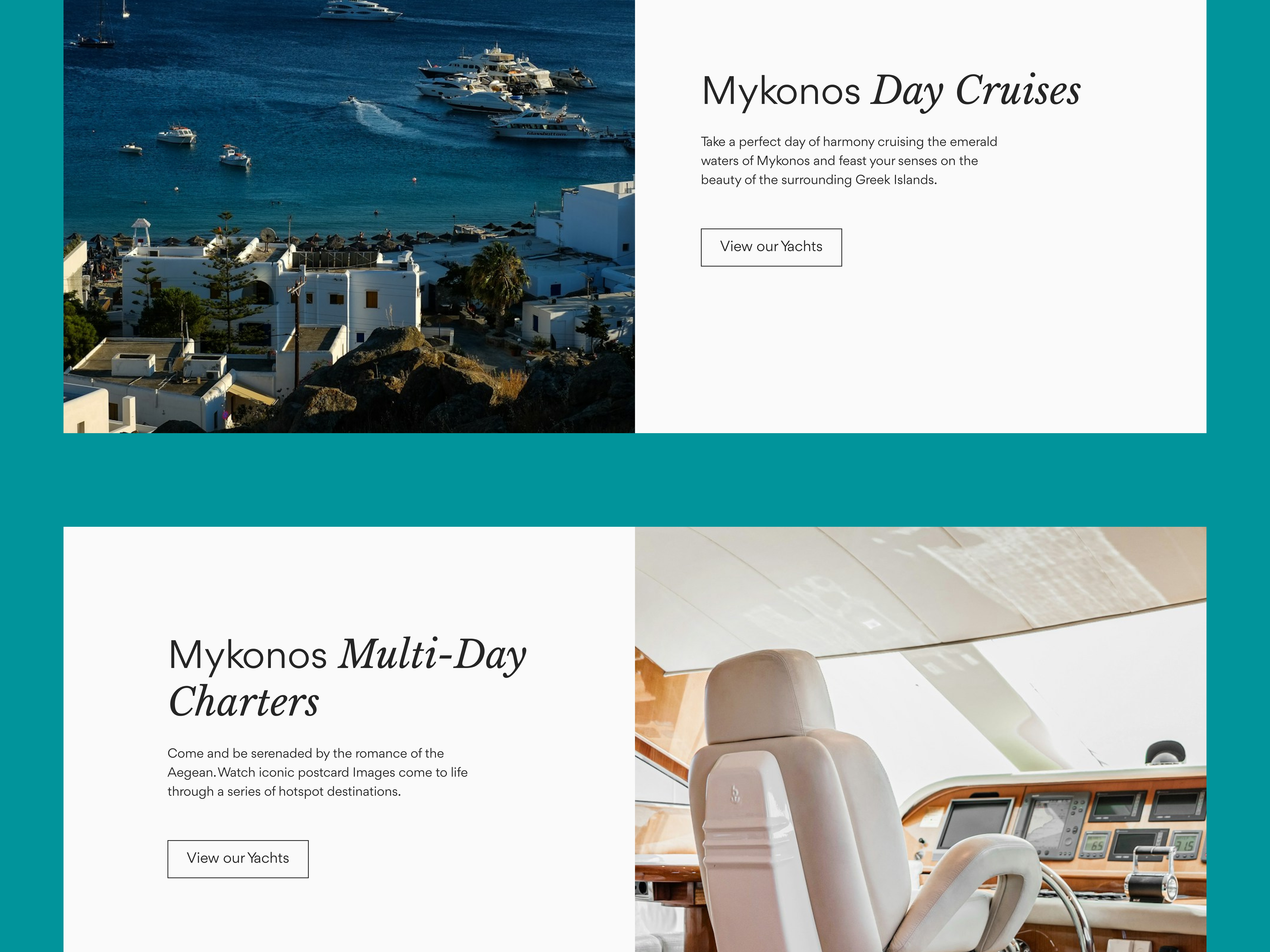
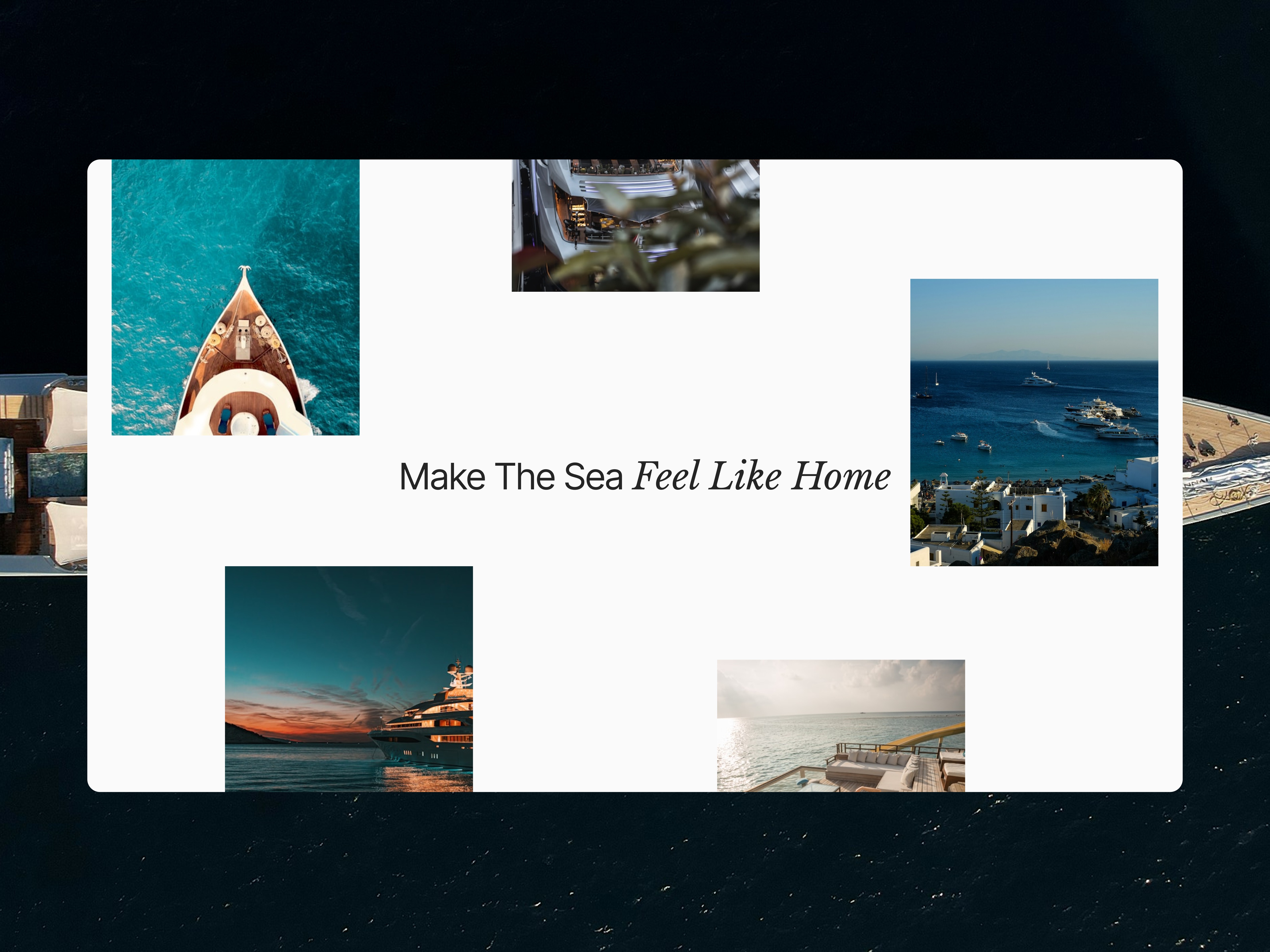
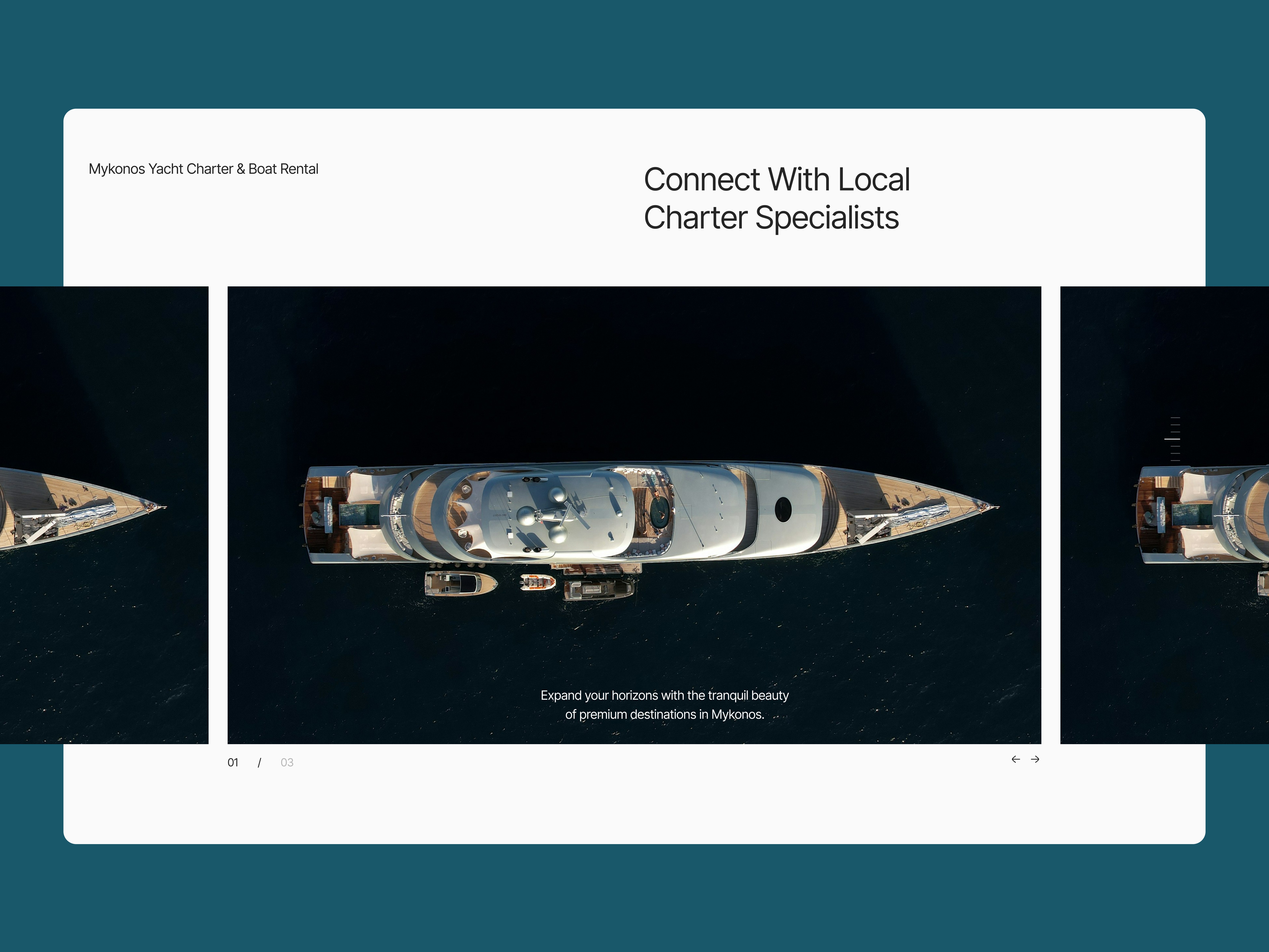
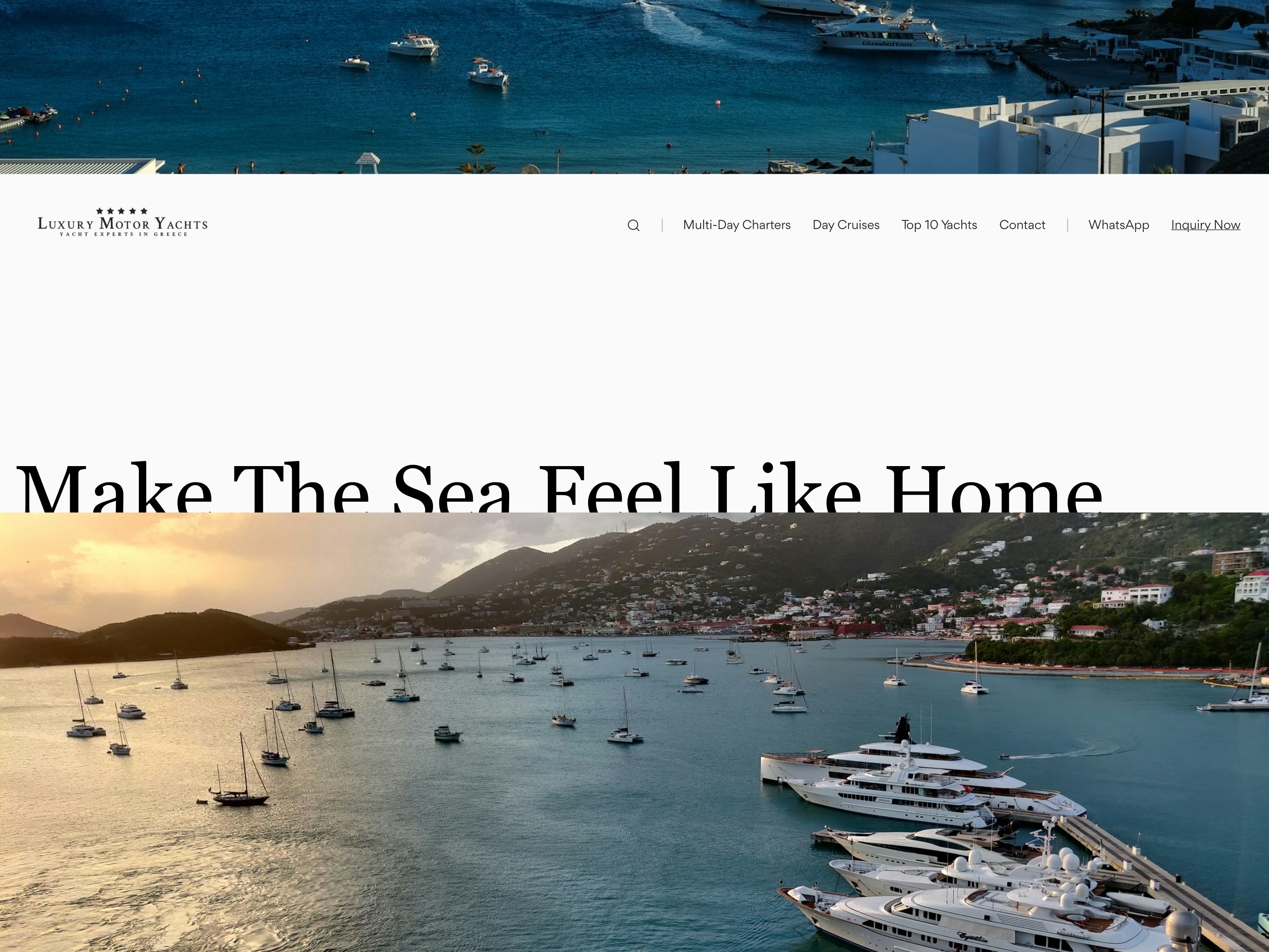
The new direction is clean, minimal, and elegant — inspired by premium travel and concierge brands. We introduced a lighter, more balanced color palette, improved spacing to create a sense of openness, and established a clearer visual rhythm across all pages.
Typography played a key role in this transformation. We moved toward a more refined, editorial style — combining elegant headline fonts with clean, highly readable body text. The result feels polished and sophisticated, while remaining functional and easy to navigate.
Imagery was also carefully curated. Instead of inconsistent visuals, we focused on high-quality photography that highlights both the yachts and the Mykonos lifestyle, creating a stronger emotional connection and reinforcing the brand’s positioning.
The result is a noticeably more premium and cohesive website that feels aligned with the brand’s identity. Key pages now communicate value more clearly, the overall experience feels lighter and more refined, and the visual consistency strengthens trust and perception.
All updated designs were delivered in Figma, including desktop and mobile versions, along with typography and imagery guidelines — ensuring a smooth and efficient implementation within the existing system.

More work
Contact
We keep things lean, clear, and responsive. Drop us a note — we’ll reply fast.