Client
Rescript Journal
Year
2025
Timeline
6 weeks
Focus
Trauma-informed app experience
Rescript Journal — Trauma-Informed App Design
UX/UI Design for a Trauma-Informed Journaling App
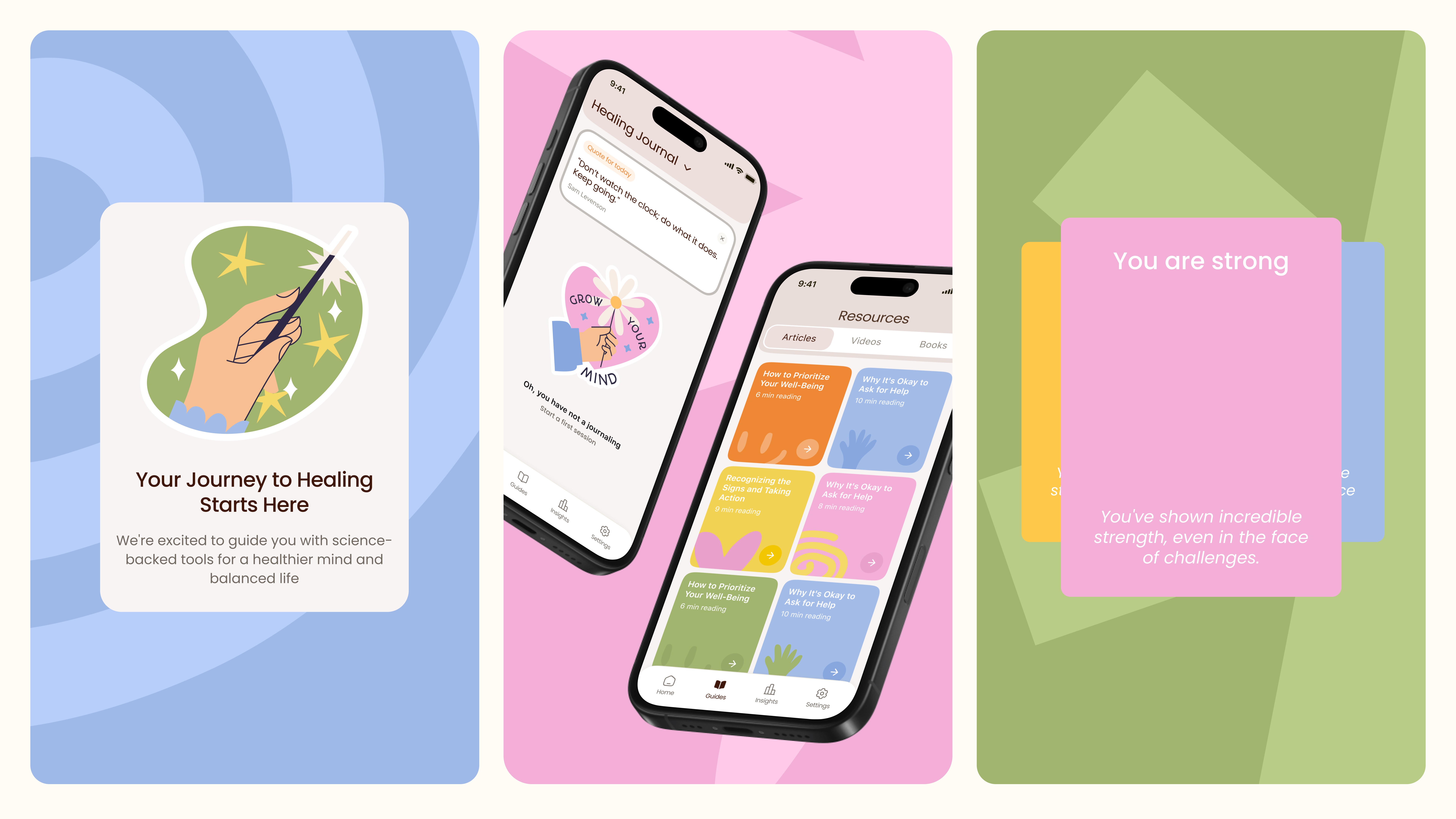
Rescript Journal is built on a specific, research-backed method — James Pennebaker’s structured expressive writing framework, shown to reduce stress and support emotional processing over a 4-day cycle.
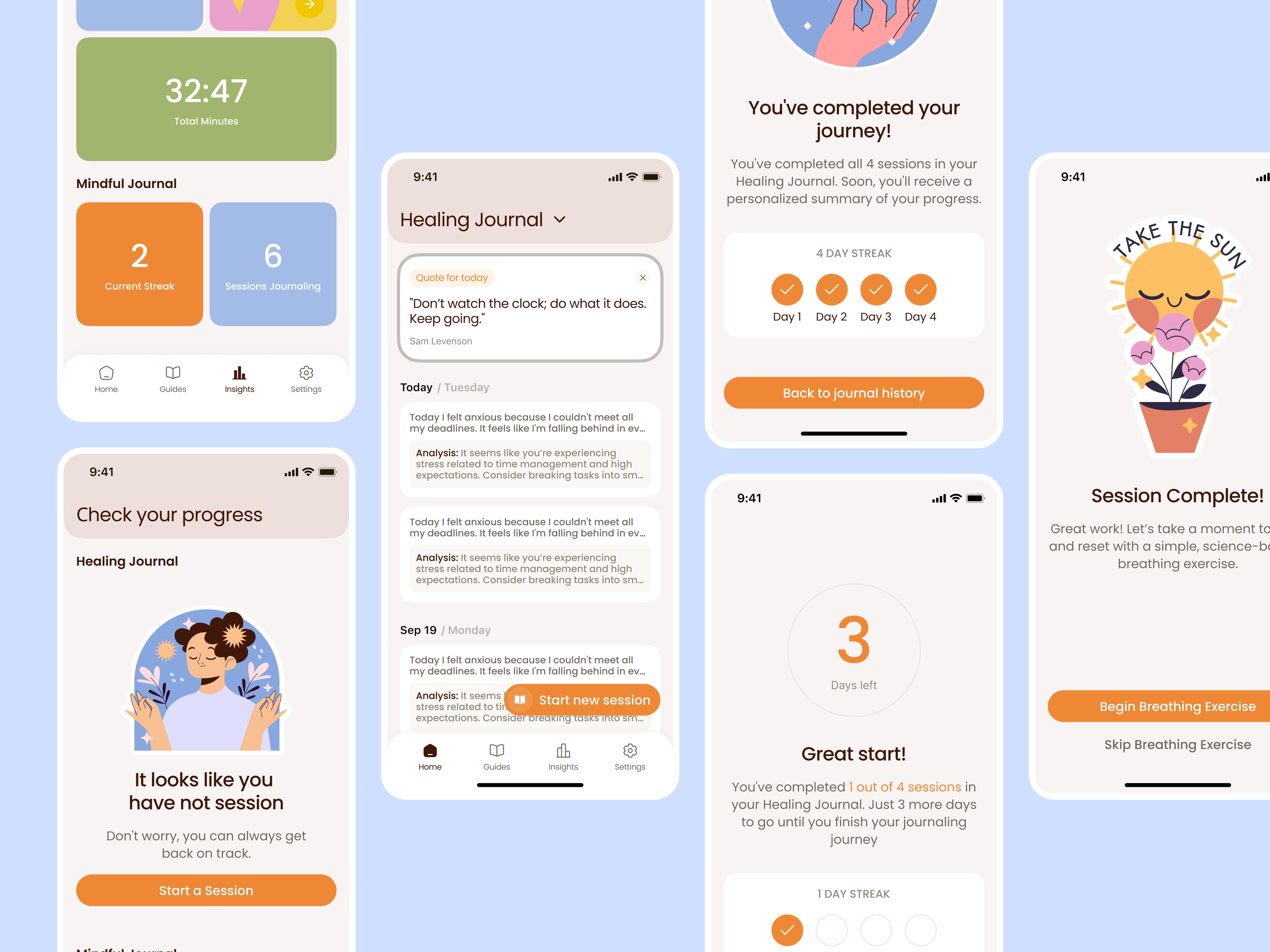
When the team came to us, the challenge wasn’t the concept. It was translating something that works clinically into something that feels safe enough to actually use.
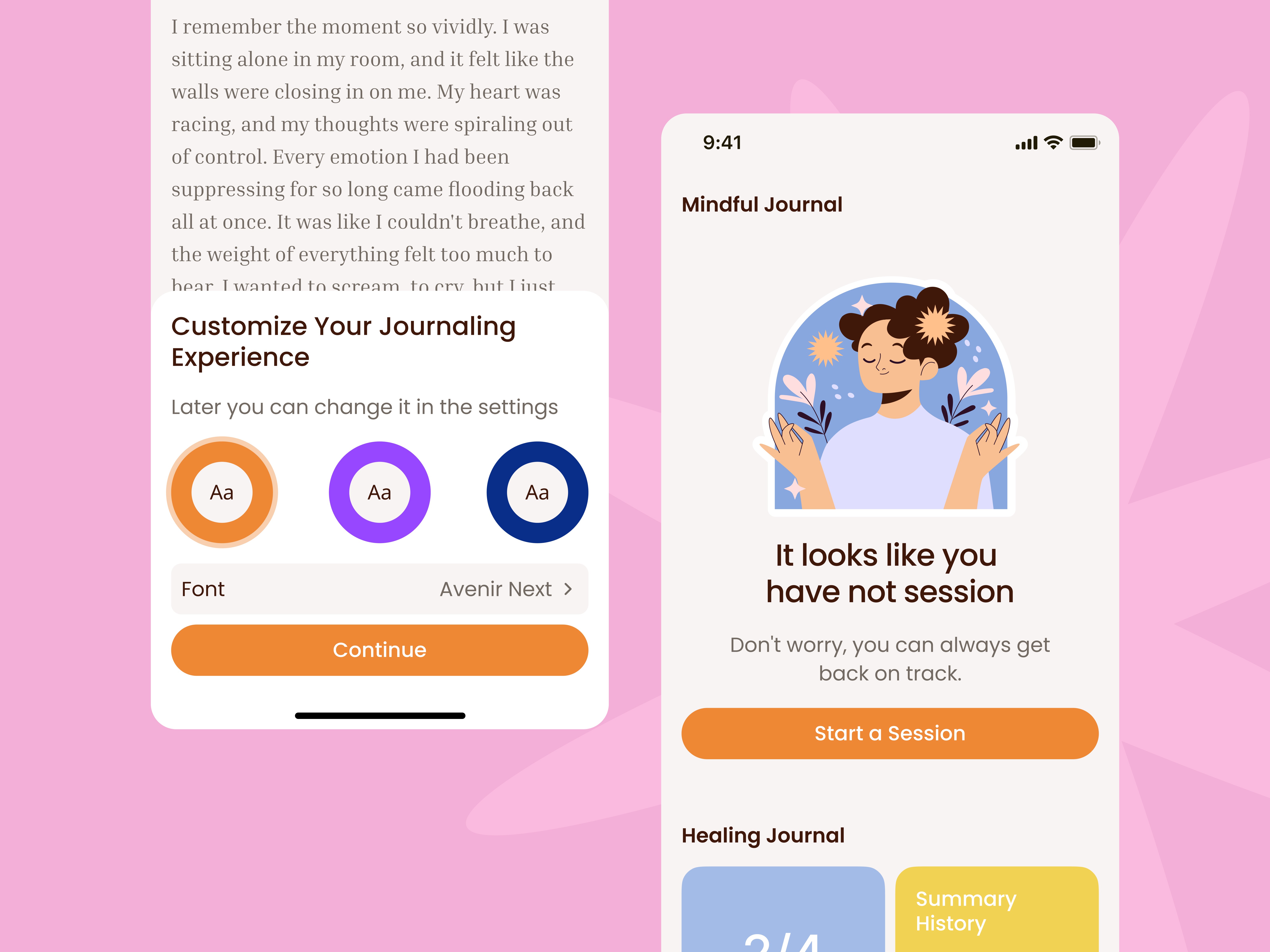
The product splits into two distinct branches: a Healing Journal for deep, trauma-focused writing sessions, and a Mindful Journal for daily reflection and habit-building. Both needed to feel like they belonged to the same emotional space — supportive without being clinical, structured without feeling rigid.
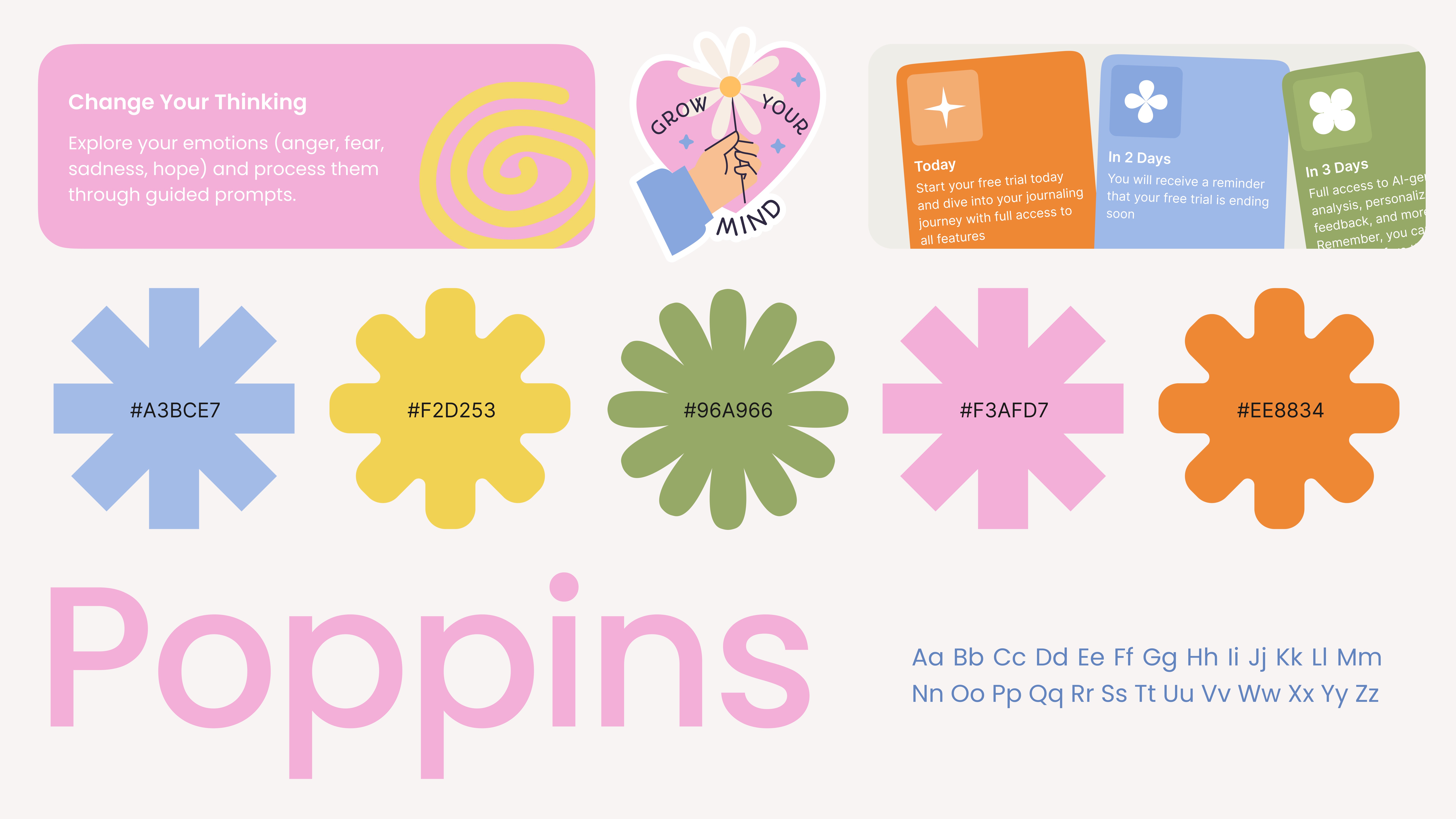
The visual direction came from an unexpected reference point. Journaling is personal — most of us had notebooks filled with stickers, handwriting, and doodles. That sense of creative ownership and safety was the emotional register we designed toward, rather than the clean, minimal aesthetic most wellness apps default to. Earthy tones, soft pastel gradients, rounded typography — nothing harsh, nothing that competes with what the user is trying to do.
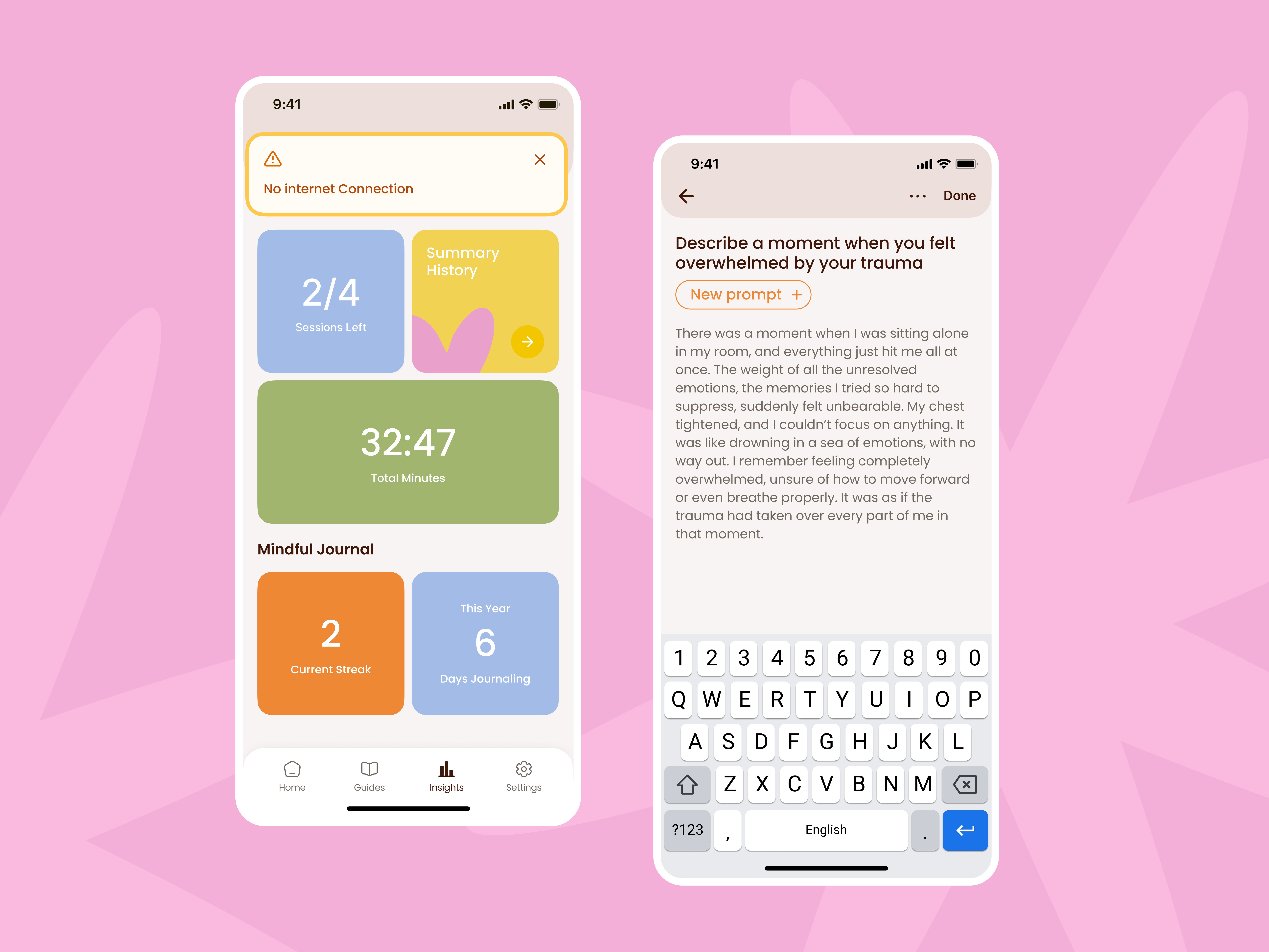
Every UX decision was tested against one question: does this make the user feel more or less safe? Information hierarchy, transitions, prompt pacing, empty states — each element was mapped to the emotional state a user might be in when they open the app. The interface stays out of the way precisely when it needs to.

We stayed involved through development — checking transitions, responsiveness, and analytics integration at each stage rather than handing off at the design stage. The final product holds the design intent end to end.


More work
Start Project
Have a product, brand, or website to improve? Tell us what you’re building — we’ll reply within 24 hours.