Published
Outcome
A shared system for faster design and AI-assisted development
Category
Strategy
Strategy
Why Startups Need a Design System—Especially When Building with AI
Written by
Sofia B.


Startups are often told that a design system is something to build later—after product-market fit, after funding, or after the team grows. That advice sounds lean, but it can create an expensive problem: every new screen becomes a fresh design decision, every developer implements familiar patterns differently, and every product update increases inconsistency.
A startup does not need an enterprise-scale design system on day one. It needs a small, practical system that connects product decisions, interface design, and code. This becomes even more valuable when the team uses AI coding tools such as Codex: an agent produces better, more consistent work when it can follow explicit tokens, reusable components, states, and rules.
This guide explains why startups need a design system, what to include at the MVP stage, and how a designer, a developer, and an AI coding workflow can use the same foundation to build a product faster without sacrificing quality.
What Is a Startup Design System?
A design system is a shared product language. It combines reusable visual decisions, interface components, interaction patterns, and implementation guidance. Its purpose is not to make every screen identical. Its purpose is to make repeated decisions predictable.
At a practical level, an early-stage design system may include:
Color, typography, spacing, radius, elevation, and motion tokens.
Buttons, inputs, selectors, cards, tables, navigation, dialogs, and feedback states.
Responsive layout rules for desktop, tablet, and mobile.
Light and dark themes when both are required.
Accessibility requirements and interaction states.
Clear naming shared between Figma and the codebase.
Short documentation explaining when and how each pattern should be used.
The system can begin small. What matters is that the product’s most frequently reused decisions stop living only inside individual screens.
Why Startups Benefit Earlier Than They Expect
It reduces repeated design and development work
Without a system, a designer repeatedly specifies buttons, form fields, cards, tables, and spacing. A developer repeatedly interprets and rebuilds them. Small differences accumulate: one modal uses a different radius, one table has another empty state, and one mobile view behaves differently from the rest of the product.
With shared foundations, the team solves a recurring problem once and reuses the answer. New features can be assembled from known parts, leaving more time for product logic and the genuinely unique parts of the experience.
It makes a small team operate like a larger one
A startup with a limited budget may begin with one product designer and one strong developer. The designer defines the user journeys, information hierarchy, responsive behavior, reusable components, and states. The developer implements the same system as coded components and connects the business logic.
This setup does not remove collaboration. It makes collaboration more focused. Instead of debating basic UI decisions on every ticket, the pair can concentrate on user problems, edge cases, data, and product outcomes.
It prevents design debt from becoming technical debt
Inconsistent UI is not only a visual issue. Duplicated components create duplicated code, different behaviors, more QA work, and slower releases. When the product needs a change, teams must find and update many separate implementations.
A design system gives the team a controlled place to improve a pattern. Updating the component can then improve every screen that uses it.
Why Design Systems Matter Even More with Codex and AI Coding
AI coding tools are fast at producing interfaces, but speed alone does not guarantee product consistency. If the input is only a screenshot and a broad prompt, the agent must infer typography, spacing, component structure, responsive behavior, and interaction rules. Different prompts can produce different answers.
A design system reduces that ambiguity. Tokens give exact values. Components provide allowed structures. Documentation explains behavior. Existing coded patterns show how the product handles accessibility, loading, empty, error, hover, focus, and disabled states.
AI coding becomes more reliable when the product’s design decisions are expressed as reusable rules rather than hidden inside individual mockups.
A design system gives AI structured context
Instead of asking an agent to “make a green dashboard,” a team can specify the product’s semantic color tokens, approved chart palette, card component, table rules, spacing scale, and responsive grid. The agent is no longer inventing the visual language. It is composing within a known system.
This is useful for Codex, Cursor, Claude Code, and other AI-assisted development workflows. The specific tool may change, but the principle remains stable: better context produces fewer arbitrary decisions and less corrective work.
Reusable components make AI-generated code easier to review
If an agent builds a feature from approved components, a developer can review the feature’s logic instead of auditing every CSS value. Reuse also reduces the chance of generating a second button, modal, or input implementation that behaves differently from the existing product.
The developer still owns architecture, security, performance, accessibility, and production quality. The system simply gives both the human and the AI a safer starting point.
The Lean Team Model: Designer + Developer + Design System
For many early-stage products, a compact team can work effectively when responsibilities are clear.
The product designer owns the experience logic
The designer should not only draw screens. They define the core user flow, navigation model, information hierarchy, component behavior, validation, responsive rules, and edge cases. They also decide which patterns must be standardized and which are genuinely unique.
The developer turns the system into a working product
The developer translates tokens and components into the codebase, connects data and APIs, implements application logic, and ensures the system works in production. Where possible, coded components should mirror the naming and variants used in design.
Codex accelerates composition and repetitive work
Once the foundation exists, an AI coding agent can help assemble screens, apply established patterns, generate variants, update tokens, refactor repeated code, and support testing. This can reduce the time spent on predictable implementation work while keeping the developer in control of important decisions.
For a small budget, this model is often more useful than hiring many disconnected specialists before the product direction is stable.
What to Build First: A Lean Design System for an MVP
A startup design system should grow from the product, not become a separate design project. Start with the components required for the core journey.
1. Foundations
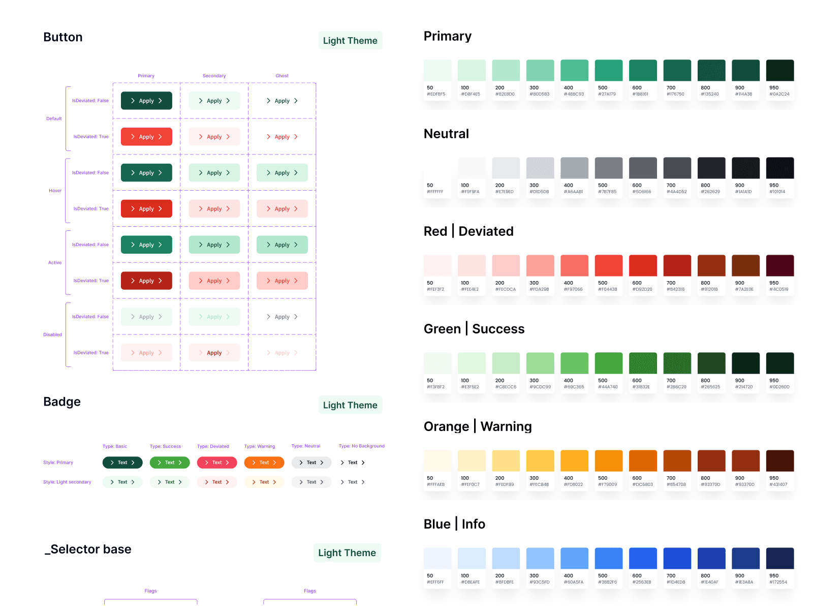
Define semantic colors, typography roles, spacing, grid, radii, borders, elevation, and motion. Prefer names that describe purpose—such as surface, primary action, success, warning, and destructive—rather than names tied to a specific hex value.
2. Core controls
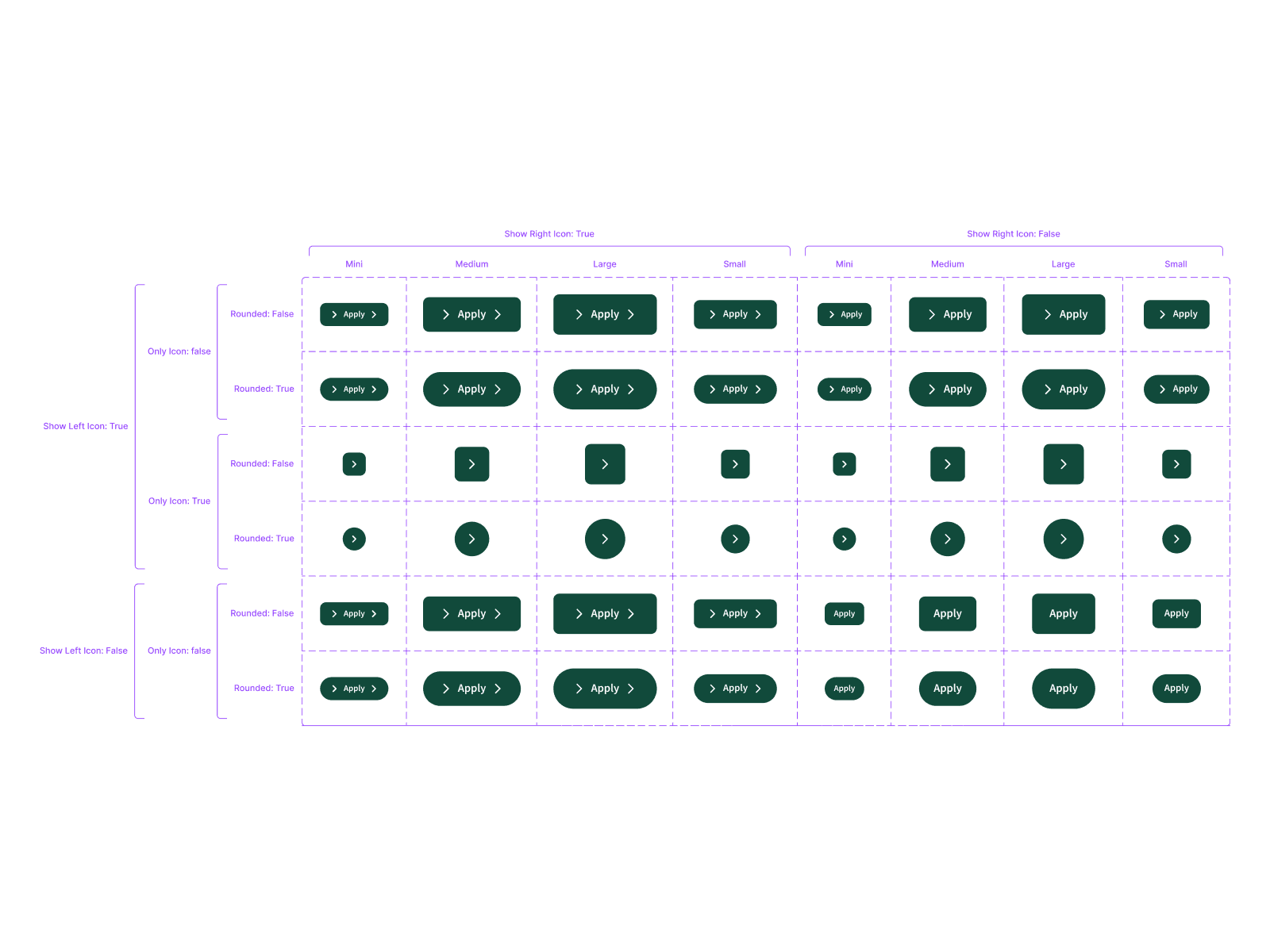
Build buttons, links, inputs, selectors, checkboxes, toggles, and date controls with all important states. Include default, hover, focus, active, disabled, loading, error, and success behavior where relevant.
3. Product patterns
Add the repeated structures that define the product: dashboard cards, tables, charts, filters, navigation, modals, empty states, notifications, or onboarding steps. These patterns often create more real leverage than a large collection of generic atoms.
4. Responsive and theme rules
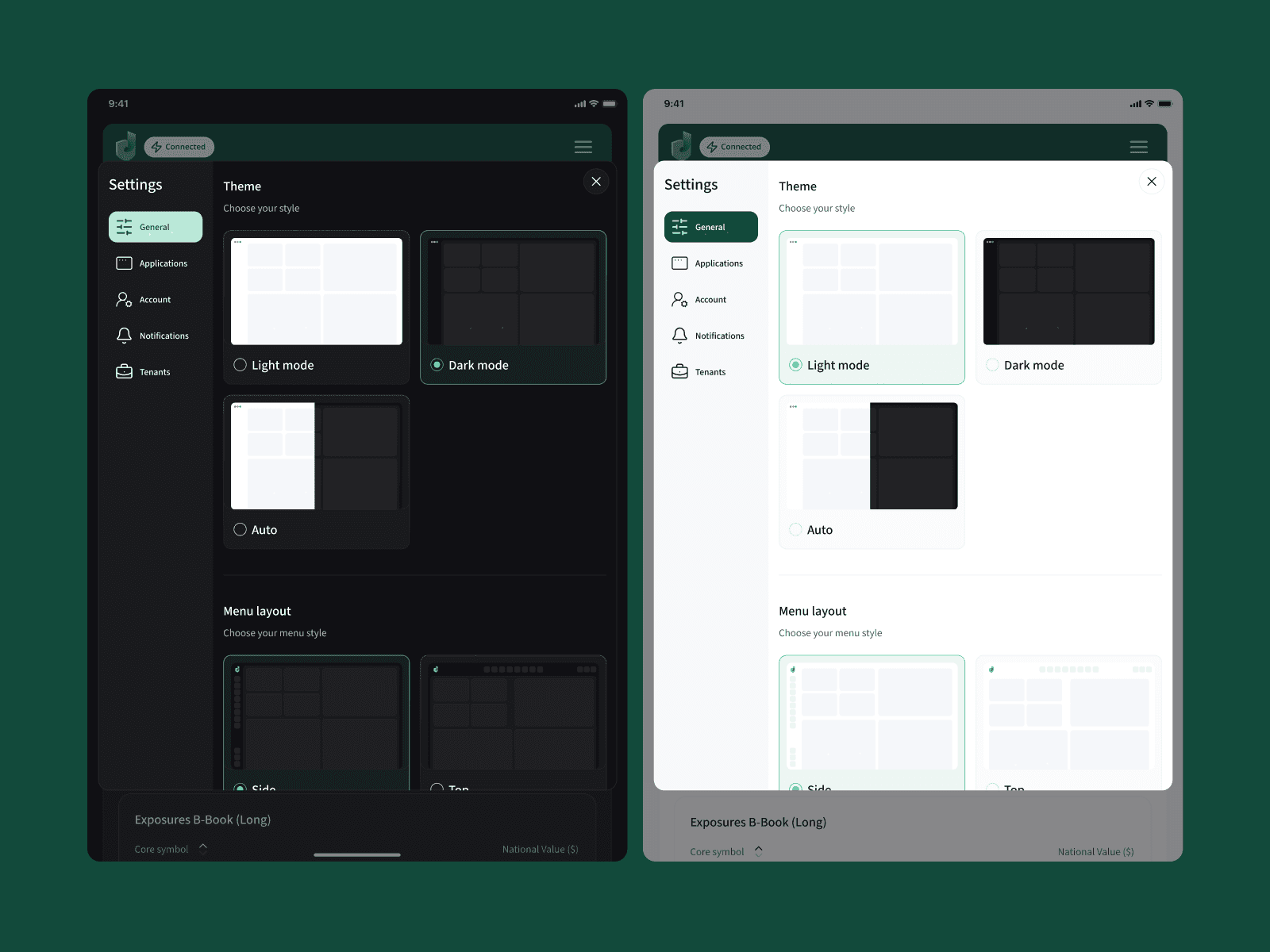
Document how navigation collapses, grids change, tables adapt, dialogs behave, and content prioritizes on smaller screens. If the product supports light and dark themes, build both through tokens rather than duplicating every component.
5. Design-to-code mapping
Align names between Figma and code. A component called Button / Primary / Disabled in design should not become an unrelated one-off class in development. Document props, variants, token references, content rules, and accessibility expectations.
Dealio: A Design System for a Complex Product
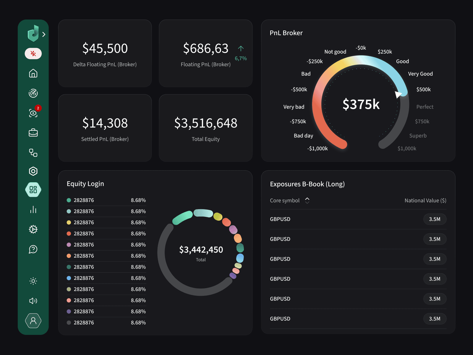
Dealio is a strong example of why system thinking matters. The product includes dense financial dashboards, risk indicators, charts, tables, navigation modes, settings, responsive layouts, and both light and dark themes. Designing each screen independently would make implementation slow and future changes risky.
The system organizes the interface into reusable decisions: semantic color scales, navigation states, data cards, chart treatments, inputs, selectors, buttons, badges, calendars, tables, and responsive patterns. The same building blocks can support a full desktop dashboard, a compact mobile view, or a different theme without redesigning the product from scratch.
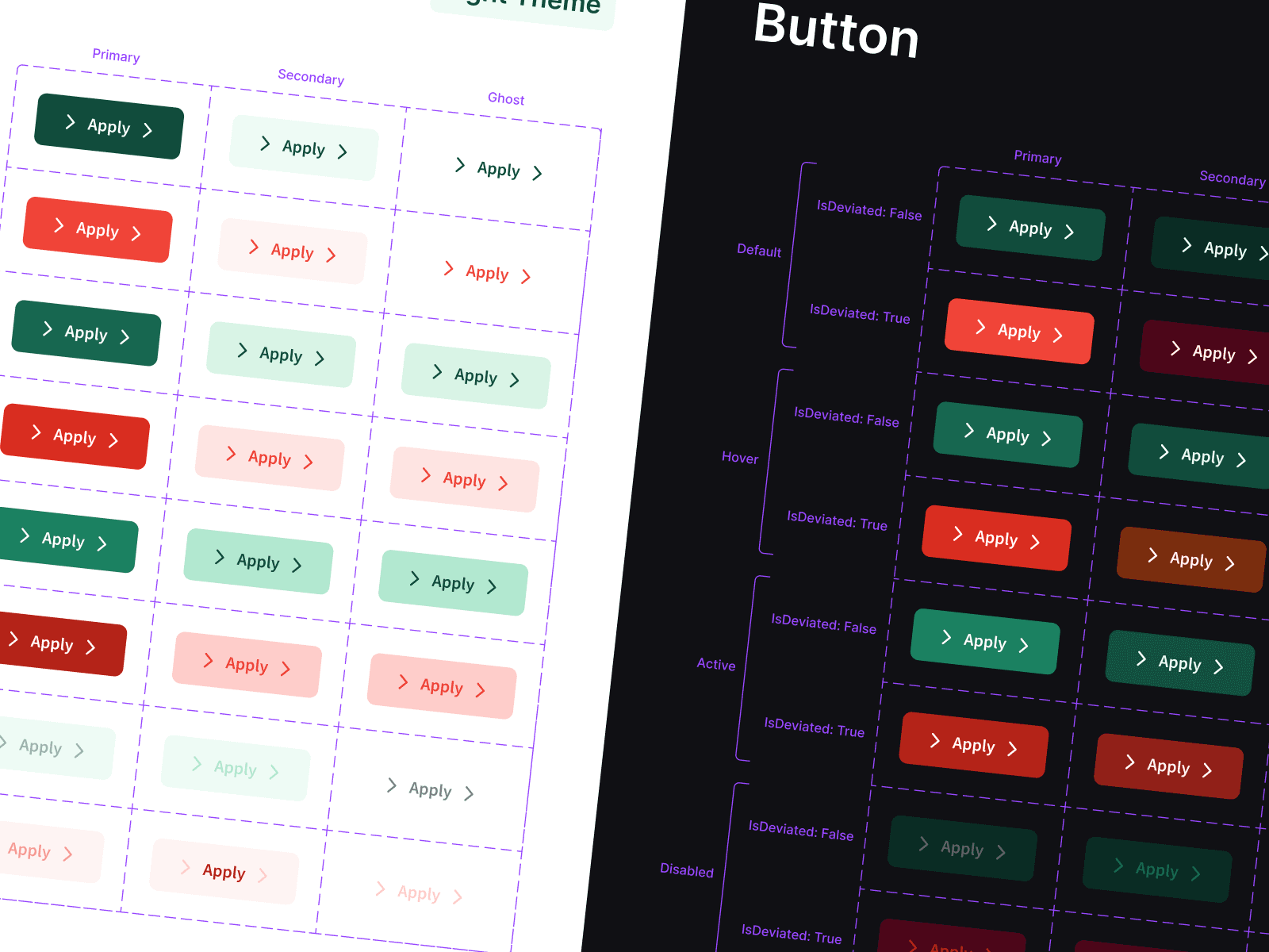
That structure helps development in three ways. First, engineers receive clear variants instead of guessing from screenshots. Second, new features can reuse existing components. Third, brand or style changes can be applied through tokens and shared components rather than manually rebuilding dozens of screens.
Designed by The Ash Design for Dealio, the system demonstrates how a product can remain visually consistent while supporting complex data, multiple layouts, and continued feature development.
The product is live at dealio.ai as a cloud-based risk management and business intelligence platform for online trading brokers, investment funds, and banks. Its production scope confirms why a reusable system was essential: the platform combines real-time exposure monitoring, P&L and trade reporting, configurable alerts, cross-device dashboards, and integrations with trading infrastructure. Dealio also describes an API-first architecture based on OpenAPI, integrations with MT4, MT5, cTrader, and Match-Trader, and notifications across email, Slack, SMS, Viber, WhatsApp, Telegram, mobile, and web channels. Each capability creates repeated states, permissions, data-density decisions, and responsive behaviors that benefit from shared components rather than screen-by-screen design.
The lesson for startups is practical: build the system around the product’s real operational complexity. For Dealio, that meant treating charts, tables, risk alerts, theme variants, responsive navigation, and dense financial states as reusable product infrastructure—not decorative UI. Explore the live product at dealio.ai.
How a Design System Makes Rebranding Easier
Rebranding a product without a system often means searching through the codebase for colors, fonts, shadows, icons, and component-specific overrides. The visible change may look simple while the implementation becomes slow and fragile.
With semantic tokens and reusable components, the team can update the brand at the system level. A new primary palette, type scale, radius strategy, or surface hierarchy flows through the product more predictably. Some screens will still require design review, but the mechanical part of the change becomes much smaller.
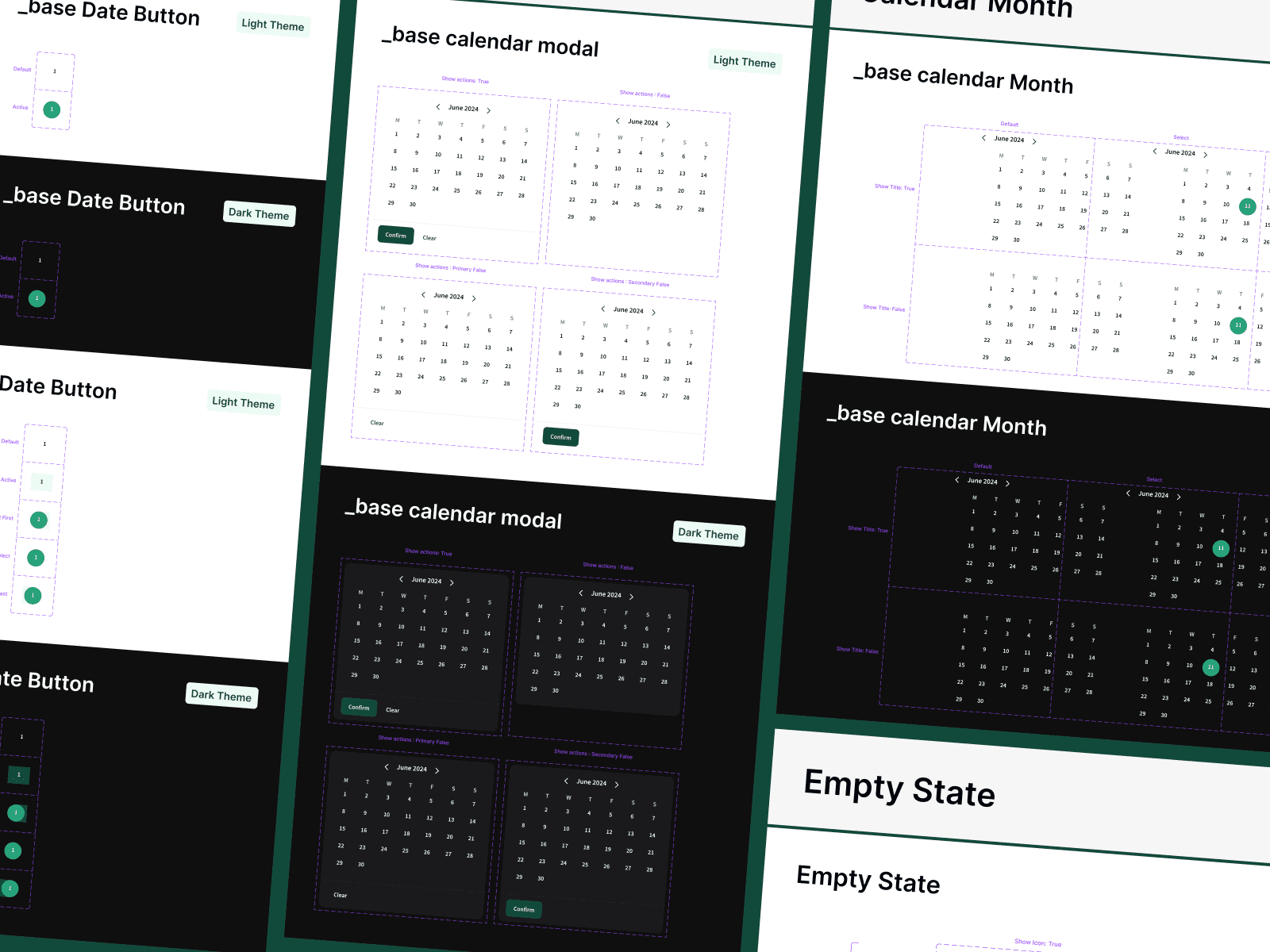
This also supports white-label products and products serving multiple brands. Shared structure can remain stable while theme-level decisions change.
Common Design System Mistakes in Startups
Building too much before the product exists. Start with the core journey and proven repetition. Do not spend months documenting components the MVP may never use.
Treating the Figma library as the entire system. A real design system must connect design decisions to coded components and team behavior.
Ignoring states and edge cases. A default button or clean dashboard is not enough. Real products need loading, error, empty, permission, overflow, and responsive behavior.
Using visual names instead of semantic names. “Green 500” describes a value; “Success” describes why it exists. Semantic tokens are easier to change and easier for developers and AI agents to apply correctly.
Allowing components to diverge silently. The design and code libraries need lightweight ownership. When one changes, the other should be reviewed.
When Is a Startup Ready for a Design System?
You are ready when the same interface decision appears more than once, when multiple people contribute to the product, or when inconsistency is slowing implementation. For most digital products, that moment arrives during the MVP—not years after launch.
The right question is not whether a startup can afford a massive design-system initiative. It is whether the team can afford to keep rebuilding the same decisions and correcting the same inconsistencies.
Build the System Your Product Actually Needs
A lean design system helps a startup move faster because it turns repeated design choices into shared infrastructure. It gives designers a coherent language, developers reusable implementation patterns, and AI coding agents structured context they can follow.
Start with the foundations and components required for the core experience. Connect them to code. Add documentation where ambiguity creates risk. Let the system grow alongside validated product needs.
Building an MVP, modernizing an existing product, or preparing your interface for AI-assisted development? Book a product discovery call with The Ash Design to create a practical design system that supports both design and development.

