Published
Location
Duration
Topic
UX
UX
From Minimalism to Nostalgia: Redesigning a Landing Page with the Spirit of the 80s
Written by
Ella S.


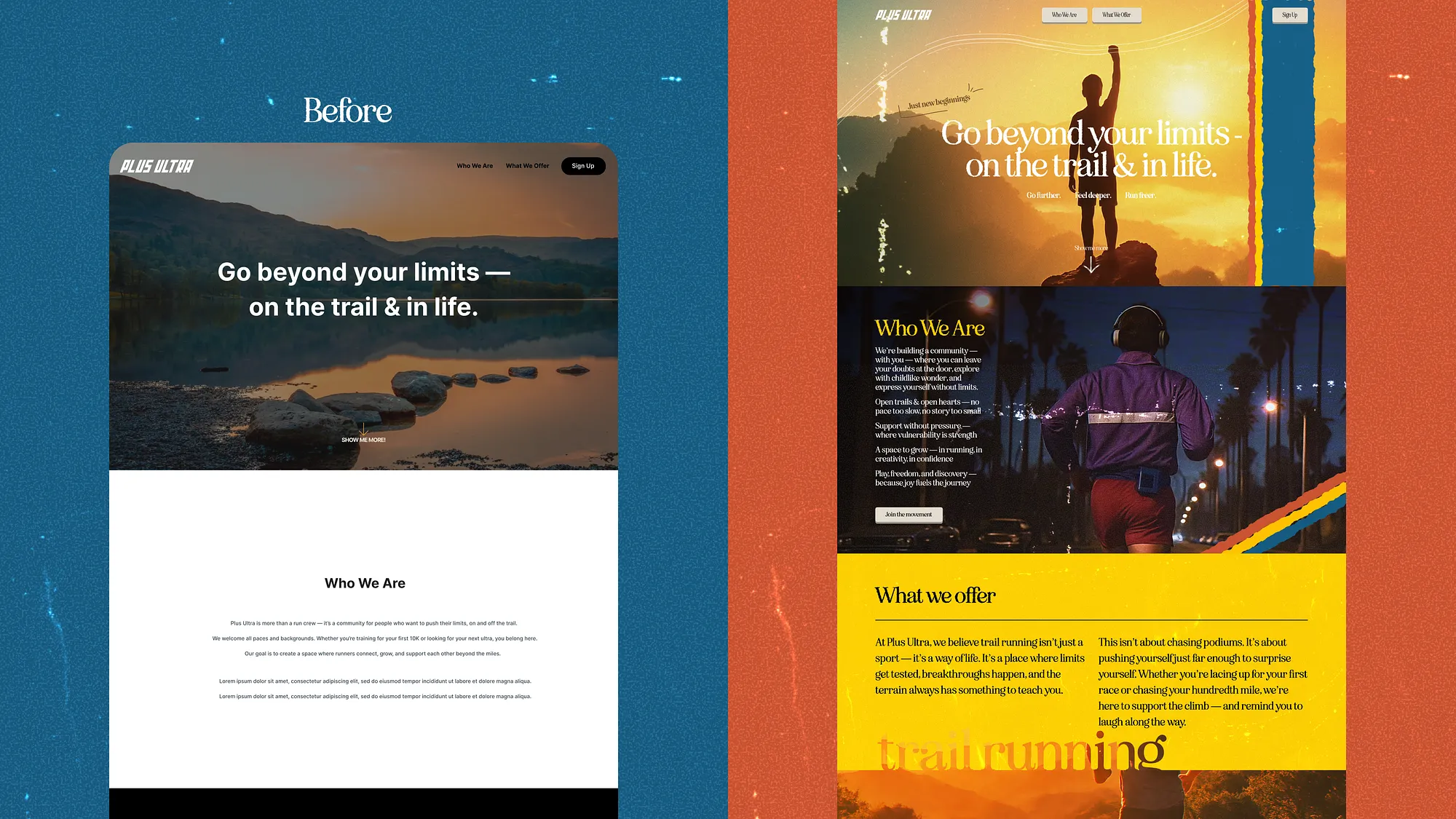
When we first looked at the landing page, one thought immediately came to mind: too clean, too minimal, too forgettable.
It was functional, yes, but it didn’t tell a story. Users could scroll through it in seconds and forget the product entirely.
The challenge was clear: give the website a soul.
The Brief
The task was simple on paper — redesign the landing page.
But the real mission was deeper: breathe identity into the brand, connect emotionally with the audience, and build something that wasn’t just a website, but an experience.
The Concept: Bringing the 80s Back
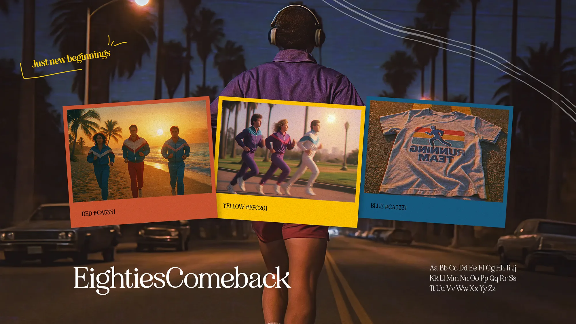
We turned to the golden age of bold posters, cassette tapes, first sneakers ads, and polaroid frames. The 80s weren’t just a decade — they were a feeling. Orange sunsets, grainy photos, bright typography, melodic optimism.
This nostalgia wasn’t a random aesthetic choice. The company’s brand values aligned perfectly with it: community, freedom, energy, and the joy of movement. Our job was to translate those values into a visual system.
Design Process
Research — exploring vintage ads, trail running culture, retro posters.
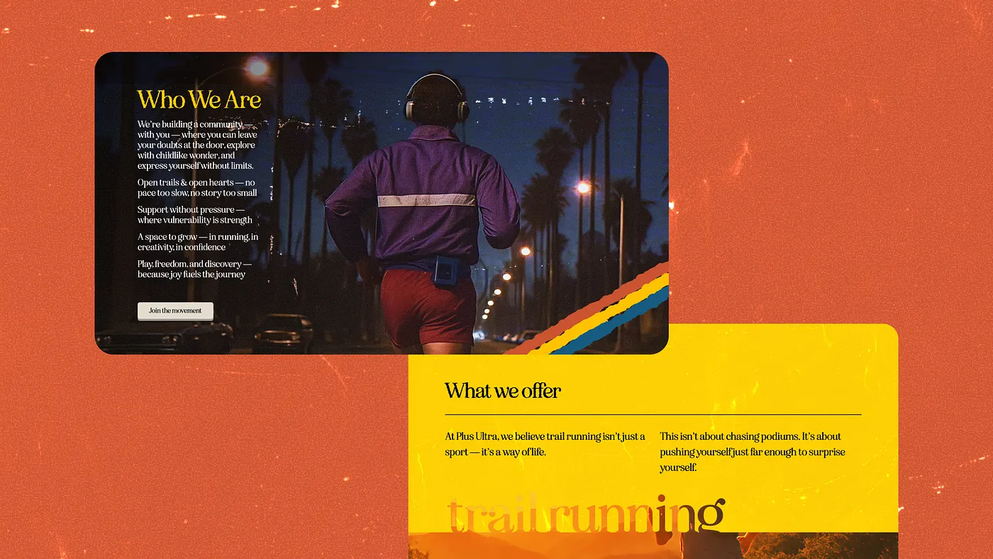
Visual Language — muted yet warm tones, noisy textures, polaroid-style cards, bold retro typography.
Identity Shift — from an ultra-minimal layout to a site that breathes with story, color, and cultural references.
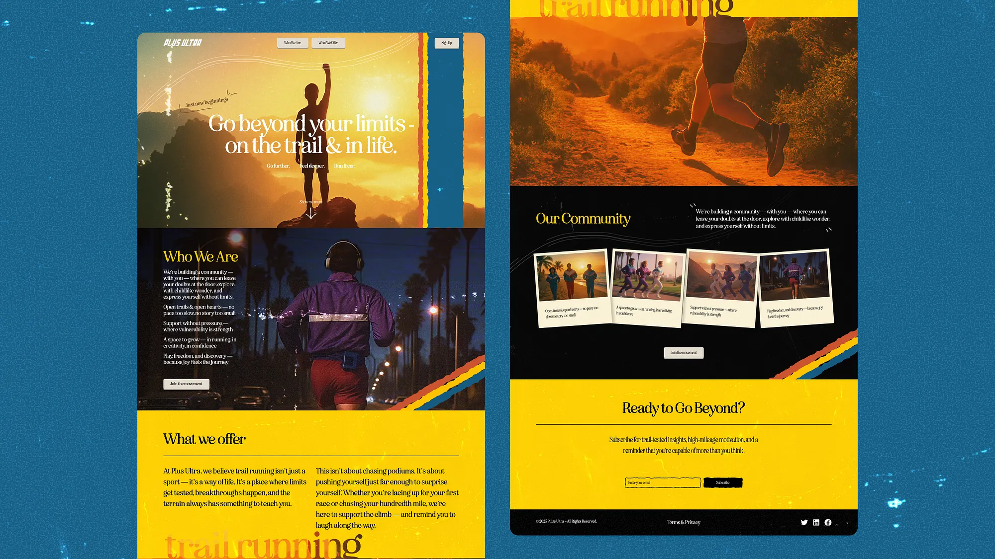
Execution — we rebuilt every section: hero with a cinematic feel, community highlights framed like polaroids, and a color palette that immediately places you in the retro mood.
Before → After
Before: a minimalist, almost sterile landing page. Easy to navigate but impossible to remember.
After: a nostalgic yet modern digital stage, where every element carries emotion. The landing page now feels like entering a retro trail-running magazine — inspiring, bold, and full of character.