Published
Location
Duration
Topic
UX
UX
Case Study: Pocket Medical Assistant — Lifestack
Written by
Ella S.


Imagine this: a doctor, a patient, and a vitamin-stacking enthusiast don’t meet in the TikTok comments — they gather in a simple yet meaningfully packed app. They share their supplement stacks, rate articles, and ask doctors questions. That’s how LifeStack was born: a health-focused social platform aiming to become a kind of Reddit for transparent reflections on well-being and user-friendly self-awareness.
An MVP With a Pulse
The clients came to us with a clear MVP concept: to test whether a platform could succeed where people exchange experiences with supplements, access medical advice, and engage with a culture of mindfulness.
The Ash Design Approach
We dove in headfirst:
Research into the health-tech landscape (from Reddit to Peanut to Zoe)
UX scenarios: how a user enters, adds a stack, comments, and joins a community
Moodboarding: Amalfi, Copenhagen, soft pastels, and a sense of natural calm
Design in focus: user-friendly, instantly familiar, but fresh in feeling
From the very start, we weren’t just designing interfaces — we were building a space where anyone, from a 24-year-old nootropic fan to a 58-year-old just starting their wellness journey, could feel confident and understood.
Familiarity and ease became our compass. We wanted LifeStack to feel like a space you already know — no learning curve, just a natural beginning.
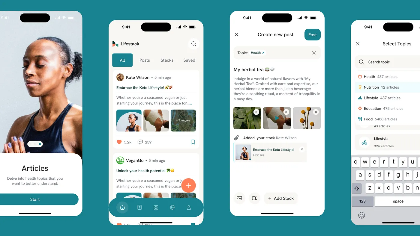
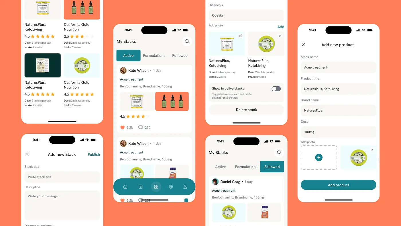
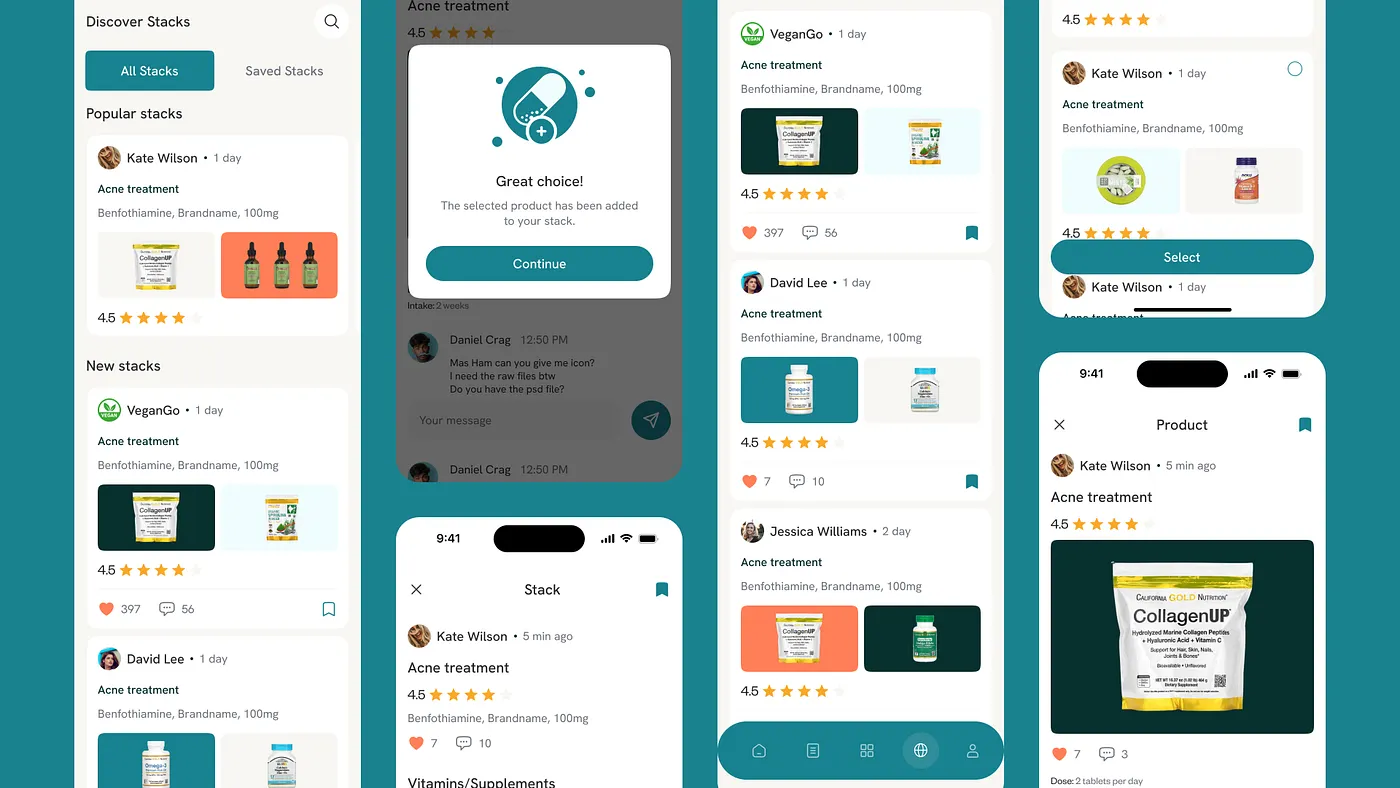
Personal stacks became a visual metaphor for intentional choices — like a bathroom shelf of supplements, only digital. Users can add supplements and wellness products, share them, or simply track their own progress.
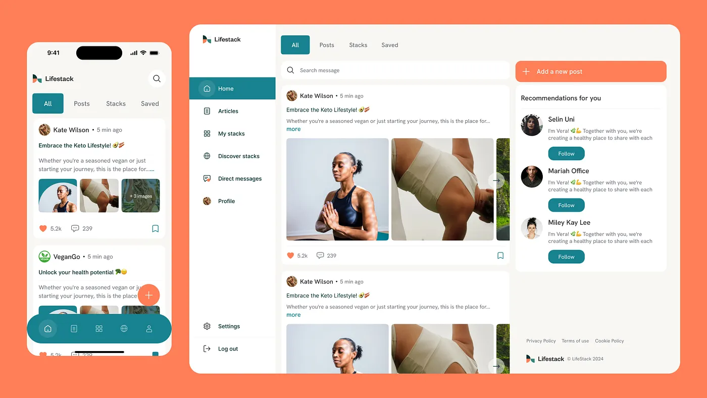
Communities, feeds, and comments weren’t added just for the sake of being a social app. This was meant to be a space where people find support, respond to each other’s stories, and ask questions that don’t go into the void — but reach equally invested others.
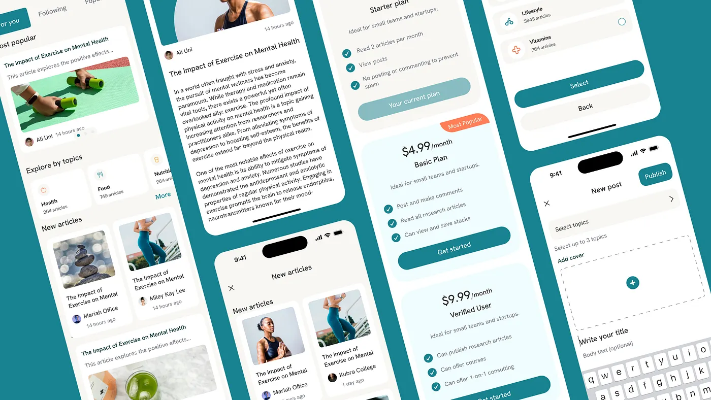
And the gated content? It’s not a paywall for profit’s sake. It’s a way to filter out the noise — highlighting expert articles and recommendations that help users better understand themselves and their bodies.
“We wanted users to feel at home the moment they opened the app — for the interface to be intuitive, almost instinctive, yet still stand out among a sea of social platforms. That’s why we chose a color approach that breaks from the familiar and gives the app a personality of its own,” says the project’s Art Director.
The Result
LifeStack answered the need for a health UX product that respects personal stories, offers intuitive navigation, and fosters a real sense of support. Its UX design works like a quiet therapist — gently bringing structure and meaning. Every screen in the app is a calm, intentional space for conversations about the self. Every feature — from profile customization to supplement reviews, article subscriptions, and community feeds — was crafted as part of a single, thoughtful system.
A Digital UX Companion for Modern Healthcare
This project showed us that UX design can become part of both wellness culture and the medical experience. The client’s bold vision, Ash Team’s deep involvement, mobile-first UX, and focus on helpful interactions turned LifeStack into a product with a future. For The Ash Design, this was a project where medicine, design, and meaning came together as one.


